

Key Takeaways
- Judge every trend by one question: does it help the right visitor understand you, trust you and get in touch?
- The trends worth using in 2027 are mostly quiet ones: clear writing, fast pages, accessible design and real proof of your work.
- Motion, 3D and bold layouts can help, but only when they support the message and the page stays fast.
- AI search tools now read your website too, so plain facts and well-organised pages matter more than ever.
- Skip anything that hides key information, slows the page down or makes your business look like everyone else.
Every year brings a new list of web design trends. Most of those lists are written for designers. This one is written for business owners who want a website that brings in enquiries in 2027.
Some trends are worth adopting now. Some are worth testing on one page first. A few are best left alone, however good they look in a design showcase. We have sorted them in that order below.
One rule runs through all of it. A trend is only useful if it helps the right visitor understand what you do, trust you and take the next step. If it does none of those things, it is decoration.
Trends to Use in 2027
These five are low risk. They help visitors and search engines, and they age well.
1. Pages Written for People and AI Assistants
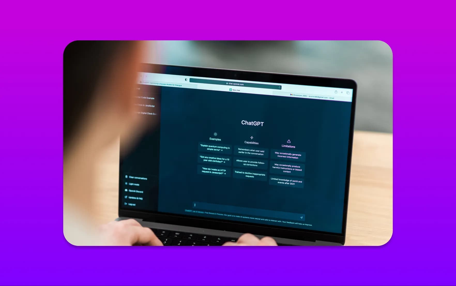
More people now ask an AI tool a question before they visit a website. Google shows AI Overviews and AI Mode, and tools such as ChatGPT and Perplexity summarise web pages in their answers. Your website is now read by people and by software that explains you to people.
That changes how a good page is laid out. Each heading should say what the section is about. The answer to the main question should come early, not after three paragraphs of introduction. Key facts, such as the areas you cover, what a service includes and how to book, should be in plain text rather than inside images.
Google's guidance on AI features in Search says there is nothing special to add for these features beyond normal good practice. In other words, the basics now carry more weight. Our guide to getting your business cited by ChatGPT, Perplexity and Claude goes into more detail.
2. Speed Treated as Part of the Design
Visitors notice a slow page long before they notice your colour palette. Google measures loading, responsiveness and visual stability through its Core Web Vitals. Responsiveness is measured by Interaction to Next Paint, which looks at how quickly a page reacts when someone taps or clicks.
Design choices affect all three. A large video behind the headline, several font families and a stack of third-party scripts can each slow a page down. In 2027, a sensible design process agrees a speed budget before it chooses effects, then checks the result on a normal phone rather than a fast office computer.
Our guide to Core Web Vitals explains the measures in plain English. If your current site is already slow, website speed optimisation is often a better first step than a redesign.
3. Accessibility as a Standard, Not an Extra
An accessible website works for people using a keyboard, a screen reader, a magnifier or a small phone in bright sunlight. It is also easier for everyone else to use.
The current guidelines are WCAG 2.2. The W3C's summary of what is new in WCAG 2.2 covers points such as visible keyboard focus and buttons that are large enough to tap. If you sell to customers in the EU, the European Accessibility Act covers e-commerce among other services, with some exemptions for very small businesses.
Build accessibility into the design rather than adding a widget at the end. Our article on why accessibility widgets can create risk explains why. For the legal background in the UK, see our guide to website accessibility laws. It is a summary, not legal advice.
4. Real Proof Instead of Stock Imagery
As AI-generated images become common, real photographs stand out. Pictures of your team, your premises and your finished work tell a visitor that you exist and that you have done this before.
The same goes for proof. A short case study with the client's permission does more than a page of claims. So does a review that names the reviewer, again with their agreement.
If you are planning a photo shoot, our guide to writing a website photography brief will help you get usable pictures from a single day.
5. Bold, Readable Typography
Large, confident headings and generous body text are here to stay. They make a page easier to scan on a phone, and they give a simple layout a clear personality.
Use fewer fonts and use them well. One family for headings and one for body text is usually enough. Variable fonts let a single file cover several weights, which can mean fewer files to load. Our look at typography trends covers how type choices affect trust and conversions.
Trends to Test Carefully
These five can work well. They can also slow a site down or distract from the message. Try them on one page, measure the result and keep them only if they help.
6. Motion With a Purpose
Browsers can now handle smooth page transitions and scroll-linked animation themselves. The View Transition API and scroll-driven animations can replace some of the heavy scripts older sites relied on. Check the browser support tables on those pages before you rely on them.
Use motion to show what has changed or to guide the eye to the next step. Do not use it to make visitors wait. Always respect the "reduce motion" setting that some people turn on in their phone or computer, because movement can make them feel unwell.
7. 3D and Interactive Elements
A 3D product view or an interactive diagram can explain something that a flat picture cannot. It should be a feature of the page, never the only way to reach important information. Load it after the main content, so the headline and the call to action appear first.
Our guide to 3D elements in web design covers how to add depth without losing speed.
8. Modular "Bento" Layouts
Bento layouts arrange content in tiles of different sizes, a little like a lunch box. They are good for showing several services or features at a glance.
They can also become cluttered. Give each tile one job, keep the text short and check how the tiles stack on a phone. The most important tile should still come first when everything sits in a single column.
9. Chat Assistants on the Website
An AI assistant can answer common questions out of hours and point visitors to the right page. It can also give a wrong answer about a price or a policy if nobody keeps it up to date.
If you add one, decide what it may and may not say, and make it easy to reach a person. Our guides on the customer backlash against poor chatbots and handing a chat over to a human explain the risks. We build these through our AI chatbot development service.
10. Dark Mode
Some visitors prefer light text on a dark background, especially in the evening. Offering a dark version can be a nice touch, but it doubles the number of colour combinations you need to check for contrast and brand consistency.
Our guide to whether your website should support dark mode will help you decide.
Trends to Skip
Some ideas keep appearing in trend lists even though they make websites harder to use. We would leave these alone in 2027:
- Scroll-jacking. Taking control of how the page scrolls frustrates visitors and often breaks on phones.
- Autoplay video with sound, or a heavy video behind the headline on mobile. Both cost data and patience.
- Accessibility overlays as a fix. They do not make an inaccessible site accessible.
- AI-generated people presented as your team or customers. If a visitor spots it, you lose the trust the page was meant to build.
- Hiding key details behind clicks or animations. Services, areas, prices and contact details should be easy to find.
- Redesigning just because a site looks dated. A new look will not fix unclear messaging or a slow page. Our list of signs your website needs a redesign helps you tell the difference.
A Quick Way to Judge Any Trend
Before you add a trend to your website, ask these five questions.
| Question | Why it matters |
|---|---|
| Does it help a visitor understand what we do faster? | If not, it is decoration that competes with your message |
| Does the page stay fast on a normal phone? | Many visitors arrive on mobile, often on a weaker connection |
| Can everyone use it, including keyboard and screen reader users? | An effect that excludes people also excludes customers |
| Does the page still work if the effect fails to load? | Key content should never depend on one script |
| Can we keep it up to date ourselves? | A feature nobody can edit soon goes stale |
Here is a fictional example. An accountancy firm wants its website to look modern in 2027. Instead of a 3D animation behind the headline, it chooses a clear headline that says who it helps, a short list of services, real photographs of the team and a simple contact form. It adds one subtle animation to show the steps of its onboarding process. The site looks current, loads quickly and makes the next step obvious.
If you want your team to make changes without waiting for a developer, our guide to running a website your team can edit covers editing, ownership and support.
What This Means for Your Next Website
If you are planning a new website or a redesign in 2027, start with your goals and your content. Decide what you want more of, whether that is calls, bookings or quote requests. Then choose the trends that support those goals, not the other way round.
A custom website design gives you room to use the right trends in the right places. If your site works but feels tired, a website redesign may be enough. For comparison, you can still read last year's list of web design trends.
If you are planning a website for 2027, tell us about your project. Send us your current site and what you want it to achieve, and we will tell you which of these trends are worth your budget and which you can safely ignore.
Frequently Asked Questions
What are the biggest web design trends for 2027?
The most useful trends are clear pages written for people and AI assistants, fast loading, accessible design, real photographs and proof, and bold, readable type. Motion, 3D, bento layouts, chat assistants and dark mode can also work, but they are best tested on one page first.
Do I need to redesign my website to keep up with trends?
Not usually. If your website is clear, fast and brings in enquiries, small improvements are often enough. A redesign makes sense when the site no longer reflects your business, is hard to update or fails on speed and accessibility.
Are animations bad for SEO?
Not in themselves. Problems start when animations slow the page down, move content around while it loads or hide text from visitors. Keep motion light, load it after the main content and respect the "reduce motion" setting.
Will AI search change how my website should look?
It changes how your content should be organised more than how it looks. Clear headings, early answers and facts in plain text help AI tools understand your business, and they help human visitors too.
Is website accessibility a legal requirement for UK businesses?
UK businesses that provide services have duties under the Equality Act 2010, and public sector websites have their own regulations. Our guide to website accessibility laws explains the background. For advice on your own situation, speak to a qualified adviser.