

Key Takeaways
- UX concerns the journey and how well it supports a task; UI concerns the interface people use.
- A polished screen is not proof that visitors can complete the journey.
- Ask for research findings, tested flows and implementation-ready decisions.
- Review real content, mobile behaviour and accessibility before signing off.
UX and UI are related parts of website design, but they are not interchangeable. User experience concerns how well the whole journey supports someone's purpose. User interface design concerns the screens, controls and visual system through which that journey happens. A website needs both clear decisions and a usable way to carry them out.
For a business buying design work, the distinction matters because attractive mock-ups are only one deliverable. You also need agreement about content, customer tasks, error handling and how the finished site will be assessed. This guide explains what to request and how to review it without becoming a designer yourself.
Start with a customer task, not a style
Describe what a person arrives wanting to do. A prospective client may need to check whether you handle a particular project, examine similar work and ask for a quotation. A returning customer may need to find support without reading sales material again.
Write the task in the customer's language. “Find whether this service suits a small retailer” is more useful than “engage with our solutions ecosystem”. Add the decision they need to make and the information currently missing. This gives the design team something observable to improve.
Separate the business objective from the customer task. The business may want more enquiries; the customer wants confidence that making an enquiry is worthwhile. Design must support that decision rather than placing more contact buttons in front of unanswered questions.
What UX work should produce
Expect a clear account of the audience, the evidence collected and the main problems identified. Evidence might include sales questions, support requests, analytics limitations, interviews and observed usability sessions. The findings should distinguish what was observed from what is only a hypothesis.
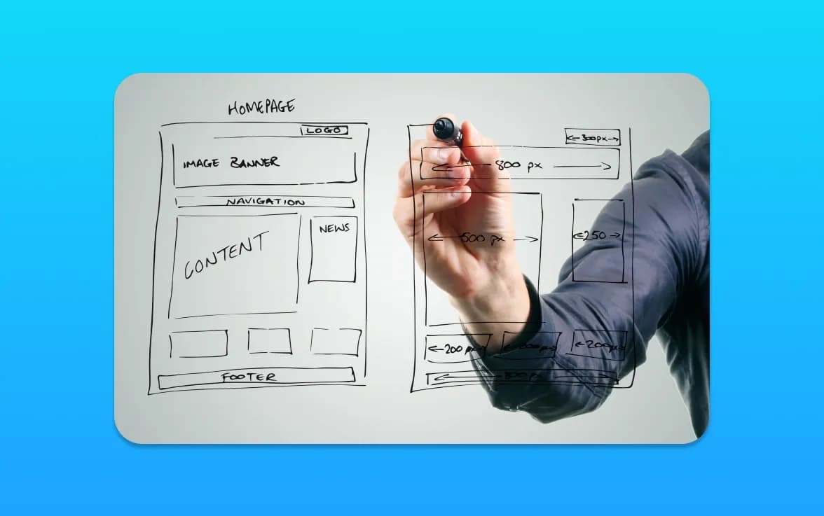
Useful outputs include a proposed information structure, task flows, wireframes and a prioritised list of issues. A wireframe explains content and hierarchy before visual polish. It should already show what a visitor needs to understand, not simply boxes labelled content.
The GOV.UK guide to moderated usability testing describes observing people attempt tasks. For a commercial project, adapt the tasks to your actual offer and record where people hesitate, misunderstand or cannot continue. Do not coach participants towards the desired answer.
What UI work should produce
UI work translates the intended journey into a coherent interface. Ask for typography, colour roles, spacing, controls and reusable components, together with representative page designs. A button's hover appearance is useful, but its keyboard focus, disabled state and error context matter too.
Review the design with real copy and images. A layout that looks balanced with three short headings may fail with actual service names. Include long content, empty results and validation errors so those decisions do not get invented during development.
Request an explanation of which parts are reusable and which are specific to one page. This helps the business maintain consistency as it adds content. A library full of almost identical components can become as difficult to use as having no shared system.
A documented example of the distinction
In the Liz Patey Makeup rebuild, the website needed to preserve a photography-led presentation while supporting different service journeys and an editable WordPress theme. The UX question was how visitors could assess suitable work and reach the relevant information. The UI work concerned how galleries, service layouts and the contact route were presented.
The portfolio documents the delivered structure and visual work. It does not establish a measured increase in bookings. Keeping that distinction clear is important when comparing agencies: ask what they changed, why they changed it and which claimed outcomes have supporting evidence.
For a theme-based example, the GTS Reading project uses service, industry and fleet routes to explain a broader offer. A project does not become good UX merely by being custom-coded. The appropriate implementation depends on the brief.
Review a prototype with a scenario
Choose a realistic starting point, such as a service page reached from search rather than the homepage. Ask someone to decide whether the offer fits and show what they would do next. Watch what they read and which links they expect to find.
A prototype can test structure and understanding without connecting to a live database. Make its limitations clear: a clickable screen is not evidence that payment, email or account features work. Record functional requirements alongside the design rather than assuming development will infer them.
Use a small issue log containing the task, observed problem, proposed change and retest result. Avoid reducing the session to whether participants liked the colours. Personal preference can be useful context, but it does not tell you whether the service was understood.
Include accessibility from the beginning
Plan readable text, logical headings, clear labels, visible focus and usable error messages. Check keyboard operation and zoom as the interface develops. The W3C introduction to accessibility is a useful foundation for agreeing responsibilities.
Accessibility is not a badge added after visual approval. Some questions can be assessed in design, while others require the implemented site and manual testing. Agree the intended standard, the testing scope and how unresolved issues will be handled. Do not describe an automated scan as complete certification.
Consider the content as part of this work. A visually obvious icon may still need a meaningful label. A form error should explain how to correct the problem, not just turn a border red. These details belong in the brief because they affect actual task completion.
Treat mobile as a real context
Review the journey on a narrow screen with long copy, a visible keyboard and slower connectivity. Check that menus can be closed, important information is not hidden and fixed elements do not cover controls. A mobile design should support the same essential decisions as the desktop version.
For shops, product-discovery UX and checkout UX involve different tasks. Separating them helps the team identify whether a customer cannot choose an item or cannot complete the purchase.
Agree implementation and handover
Ask how designs will be translated into working components and who resolves differences during development. Identify the owner of copy, imagery, licences and platform settings. Include a review of the built site against the approved tasks, not just a screenshot comparison.
An editor should be able to update ordinary content without breaking the layout. Demonstrate adding a project, changing an image and previewing the result. If an important change requires development, document that dependency and its likely process rather than promising unlimited flexibility.
Use the sixteen-point website checklist as a broader acceptance companion. It covers the operational details that design presentations can miss, including enquiry receipt, ownership and maintenance.
Measure improvement proportionately
Choose a small set of outcomes tied to the original problem. These might include successful task completion in testing, fewer avoidable support questions or more qualified enquiries from a particular service page. Keep raw clicks separate from business outcomes.
Record the release date, tracking configuration and other campaigns that could affect the comparison. Small samples can fluctuate substantially. Do not claim that a redesigned button caused a revenue change simply because both happened in the same week.
Use findings to prioritise the next iteration. If customers understand the offer but cannot judge suitability, add relevant proof. If they understand both but cannot submit the form, fix the functional problem. This is a more useful process than redesigning every page whenever traffic changes.
Our UX/UI design service can help define and test the journey. Custom website design connects that work with implementation. Share your current website and the task customers struggle with to start a practical discussion about scope.
Frequently Asked Questions
What is the difference between UX and UI?
UX concerns the overall journey and whether it supports a person's task. UI concerns the interface used along that journey. Visual design and interaction decisions overlap, but attractive screens alone do not demonstrate a successful experience.
Do small business websites need UX research?
They benefit from proportionate evidence. Reviewing real sales questions and observing a few relevant tasks can identify important problems. The research method and depth should fit the project's risk, budget and available audience.
Are wireframes the finished design?
No. They usually establish content, structure and hierarchy before detailed visual treatment. Ask what decisions a wireframe is intended to test so that feedback addresses the right stage of the project.
Can a prototype prove that the website works?
A prototype can test understanding and navigation, but may not include real forms, payments or integrations. The implemented website needs separate functional, accessibility and device testing before launch.
Will better UX automatically improve Google rankings?
No. A clearer, more usable site benefits customers, but ranking depends on many factors. Assess UX against the customer problem and measure search performance separately without promising a position or conversion uplift.