
Packaging is often treated as a finishing touch: choose a box, add the logo, send it to print. That is backwards.
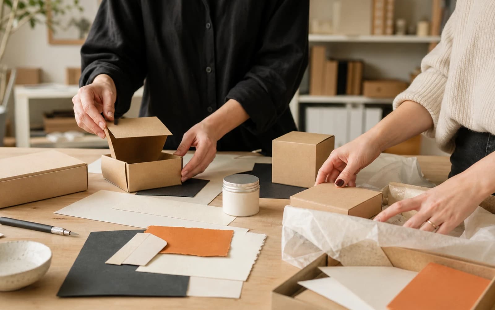
For a customer, packaging is usually the first physical proof that your business is real, considered and worth their money. It is what lands on the doorstep, sits on a shelf, gets carried out of a shop or appears in a photo after someone opens an order. Before they have used the product, it has already said something about the care behind it.
That does not mean every small business needs an expensive rigid box, foil blocking and a warehouse full of stock. It means the packaging needs a job. It should protect the product, make the purchase easy to understand and feel like it belongs to the brand. When those things line up, even a simple mailer or label can lift the whole experience.
Key Takeaways
- Packaging is part of the product experience, not just a container.
- Start with how the item is sold, handled and opened before choosing colours or finishes.
- A clear, consistent visual system makes modest packaging feel more considered.
- Good packaging works in real life: on a shelf, in transit, in a customer’s hands and in a phone photo.
- Spend on the decisions that will be repeated thousands of times, such as the format, core artwork and printing specification.
Packaging Is a Sales Tool, Even When Nobody Calls It That
Think about the moments around a purchase. Someone is comparing products online. They are standing in front of a display. A friend notices a parcel on the kitchen table. A customer films an unboxing clip. Packaging shows up in all of those places.
It helps people make a quick judgement. Is this product for me? Does it look trustworthy? Can I tell what it is? Does it feel like the price makes sense?
That is why packaging should sit alongside your website, customer service and product photography in the wider brand picture. It is not separate from them. If your online shop looks polished but the order arrives in a thin, badly labelled bag, the experience loses momentum. Equally, a simple product can feel more valuable when the packaging is clear, tidy and recognisably yours.
The aim is not to trick anyone into paying more. It is to make the value you have already created visible. A well-made product deserves a presentation that does not undermine it.
If the visual foundations are still unclear, deal with those first. A brand identity design project gives you the colours, typography, logo use and image direction that packaging needs. Without that, each label, box and insert becomes a fresh design decision, which is how brands become inconsistent very quickly.
Start With the Real-World Job of the Packaging
Before anyone opens Illustrator or picks a stock box, write down what the packaging must do.
For a food, beauty or wellness product, that may include required information, ingredients, batch details, directions and storage advice. For a handmade item, it may be protecting something delicate while still feeling personal. For an online retailer, it may be surviving a courier network and fitting through a letterbox. For a gift product, the opening experience might be a major part of the sale.
Ask practical questions early:
- Where is the product bought: online, in person, through stockists, at events or a mix of all four?
- Does it need to stack, hang, stand up or fit through a standard postal slot?
- What must be visible at a glance?
- What must be included for safety, legal or operational reasons?
- Is the customer likely to keep or reuse the packaging?
- Who packs the orders, and how much time can each order reasonably take?
These details shape the design. They also prevent expensive mistakes. A beautiful carton that is awkward to assemble will frustrate the person packing orders. A minimalist label that leaves no room for a product name may look good in a mock-up but confuse someone browsing in a shop. A large box can make a small product feel underwhelming, as well as adding unnecessary postage and storage costs.
This is where brand strategy helps. It is easier to make good packaging choices when you know who you are speaking to, what the customer should notice first and how you want the product to be positioned.
Perceived Value Comes From Clarity and Care
People often say packaging makes a product feel more premium. That can be true, but “premium” is too vague to be useful on its own.
A product feels considered when the details make sense together. The logo is sized properly. The type is legible. The colours match the rest of the brand. The material feels appropriate for the product. The copy is helpful rather than crammed in as an afterthought. Nothing looks accidental.
You do not need every possible finish to achieve that. In fact, adding too much is one of the quickest ways to make packaging feel less confident. Gloss, foil, embossing, bright colours, oversized logos and long product claims can all compete with each other. A better question is: what should the customer notice first, and what can quietly support that?
For example, a small-batch candle brand might need a strong scent name, a readable burn-time note and a label that works across several fragrances. A nutrition product might need clarity and reassurance, with a clear hierarchy for flavour, format and key information. A homeware brand might need packaging that feels giftable without being wasteful.
The right answer changes, but the principle does not: make the important thing easy to find, then give the rest of the information a sensible place to live.
Build a Packaging System, Not a One-Off Design
Small businesses often begin with one hero product. That is normal. The problem starts when the product range grows and every new item is designed from scratch.
You end up with a collection of labels that all look slightly related, but not quite. Different logo sizes, inconsistent colour choices, multiple fonts, different tones of voice and no reliable way for customers to recognise the range.
A packaging system fixes this. It gives you a framework that can stretch as the business grows.
Your system might include:
- A defined position for the logo and product name
- A consistent type hierarchy for headings, descriptions and small print
- A small set of approved colours, with a clear way to use colour for variants
- Rules for product photography, illustrations or patterns
- A repeatable layout for the back or side panel
- Guidance for stickers, inserts, shipping labels and seasonal editions
This does not make every product look identical. It makes them look like they belong to the same family. You can have a bold variant colour for each flavour, scent or product line while keeping the brand recognisable from a distance.
That consistency also makes future work cheaper and faster. Instead of briefing a designer from scratch each time, you have a tested structure to build from. The same principle applies to brochures, point-of-sale material and other printed items. A print design service is useful when you want the wider set of materials to carry the same visual language.
Design for the Shelf, the Parcel and the Phone
Packaging has more than one environment. The same design may need to work from two metres away on a shelf, at arm’s length in someone’s hand and as a small image in a customer’s social post.
On the shelf
In a busy retail setting, people do not read everything. They scan. Your product name, category and main differentiator need to be visible quickly. If a buyer has to work hard to tell what the item is, they may move on.
Stand back from a printed proof or mock-up. Can you still see the product name? Does the colour system make sense next to competitors? Does the design have one obvious focal point? This simple check catches a surprising number of issues.
In a delivery
For online orders, protection and opening matter. The outer mailer does not need to be lavish, but it should feel intentional. A branded sticker, a printed thank-you card or a short care note can be enough when the product itself is presented well.
Be realistic about fulfilment. If you are packing dozens of orders on a busy week, complex folding and multiple loose inserts may not be sustainable. The best design is one your team can deliver consistently.
On a phone
Packaging now has a second life in photos, reviews and short videos. That does not mean you should design purely for social media. It does mean the key features should still make sense in a quick photo: the brand, product name, colour and a distinctive detail.
A practical test is to photograph the packaging on a normal phone in daylight. If it looks muddy, unreadable or generic, you have learned something before the print run.
Materials and Finishes: Choose Them for a Reason
Materials affect the way a product feels before it is even opened. They also affect cost, durability, transit performance and how much environmental information you can responsibly communicate.
Start with the basic material and print method. A good uncoated stock can feel warm and tactile. A smooth coated stock can make colour photography look sharper. A simple single-colour print may be exactly right for a straightforward, confident brand. None of these choices is universally “better”; they need to fit the product and the budget.
Special finishes can add a genuine sense of care, but they need restraint. Foil can highlight a mark or product name. Embossing can give a subtle, tactile detail. A textured paper can add character. Use one strong idea well rather than five weak ideas at once.
Always ask for a physical proof or sample where possible. Screens lie about colour, texture and scale. A label can look perfect at 200 per cent zoom and feel cramped once it is on a real jar. A dark colour can print much differently than expected. A few samples are cheaper than discovering the problem after a full production run.
If sustainability is part of your offer, be precise. Use materials and disposal guidance you can stand behind, rather than broad claims that are difficult to explain. Plain language is more useful than buzzwords: tell customers what they can reuse, recycle or return, and make sure the instruction suits the actual material.
Common Packaging Mistakes That Cost More Later
The biggest packaging mistakes are usually made before printing.
One is designing from a flat artwork file without thinking about the final object. A label can curve around a bottle; a carton has folds; a mailer needs an address area; a box needs a barcode or stock code. Build the layout around the physical format from the start.
Another is treating mandatory information as a last-minute problem. It gets squeezed in, reduced to unreadable text or placed wherever there is a gap. Plan for it early and it can become part of a clean layout.
A third is changing too much at once. If you are launching a new product line, keep the core system stable. You want existing customers to recognise you, while new customers can understand the product. Reinvention is not always the answer.
Finally, do not order a huge quantity simply because the unit price looks better. Stock takes space, products change and early feedback is valuable. A smaller first run can be a sensible way to test size, colour, copy and customer response before committing.
A Straightforward Packaging Process for a Small Business
A good packaging project does not need to be complicated, but it does need a sequence.
- Define the product, customer and sales environment.
- Gather the practical requirements: dimensions, legal copy, barcodes, postage constraints and pack-out process.
- Agree the brand ingredients that will stay consistent.
- Explore a few clear design directions, rather than dozens of minor variations.
- Test the preferred direction on the real format.
- Get printer advice and physical samples before signing off.
- Create reusable artwork rules for future products and marketing material.
That final point matters. Your first package should make the second one easier, not harder.
If your existing packaging looks disconnected from the rest of your business, do not start by choosing a trend or copying a competitor. Start by understanding the brand you are building. Our packaging design service can help you turn that into packaging that works in the real world, whether you need a first product launch or a clearer system for a growing range.
Make the First Impression Match the Product
Your packaging does not need to shout. It needs to make sense.
When the format protects the product, the design is clear and the visual system is consistent, customers feel the care behind the business. That can help them understand the price, remember the brand and feel more confident about buying again.
If you are launching a product or want to make an existing range feel more joined-up, get in touch with MattDarm. We can look at the brand, the customer journey and the practical production details together, then build packaging that is ready to earn its place in the customer’s hands.