
Business cards are not dead. Bad business cards are.
A card still earns its place when it is useful: after a conversation, at a trade event, during a site visit, over coffee with a referral partner or slipped into a parcel. It gives someone a physical reminder of who you are and an easy way to get back in touch. The problem is that too many cards are designed as tiny adverts. They try to fit in every service, every social handle, every award and a paragraph about the business. The result is forgettable at best and cheap-looking at worst.
The best business cards in 2026 are simpler than that. They make one clear impression, give the right next step and feel like a real piece of the brand. Digital tools have changed what goes on a card, but they have not replaced the moment when someone hands one to another person.
Key Takeaways
- A business card should support a real conversation, not replace your whole website.
- Clear hierarchy matters more than cramming in information.
- Good paper, considered spacing and a confident layout usually beat novelty finishes.
- A QR code can be useful when it goes somewhere genuinely helpful.
- Your card should look and feel like the rest of your brand, from your website to your invoices.
Why Business Cards Still Matter
The point of a business card is not to prove that you are traditional. It is to make follow-up easier.
You meet someone, they ask what you do and you have a useful conversation. A card gives them a quick way to remember your name, your business and what they should do next. They may photograph it, put it in a wallet, pass it to a colleague or scan a code later. The card is a prompt, not a brochure.
That is why cards work particularly well for people whose business is built on trust and relationships: local service businesses, consultants, trades, event suppliers, hospitality, property, retail and professional services. They also work well when a customer is likely to recommend you in person. A clear, attractive card makes it easier for somebody else to say, “Here, speak to these people.”
A card can also give your brand a small but important moment of physical presence. Your website may be excellent, but it lives on a screen. A card brings your colour, type and logo into a person’s hand. It is a small thing, but small things are where people decide whether a business feels considered.
If your logo is still doing too much work on its own, start there. A card only feels coherent when it comes from a proper visual system. Our logo design service can help create a mark that stays legible at the small scale a business card demands.
Start With the Job of the Card
Before you choose a paper stock or look at a print finish, decide what the card needs to achieve.
For one person, it may simply be a professional calling card: name, role, business, phone and email. For another, it may need to direct people to book a consultation, view a portfolio or save contact details. For a restaurant, salon or venue, it might be a loyalty card or a discreet way to share opening hours and booking information. The same dimensions can serve very different jobs.
Ask yourself:
- Who is most likely to receive this card?
- When will they receive it?
- What should they remember after the conversation?
- What is the one action you would like them to take next?
- Will the card be used by one person, a team or multiple locations?
- Does it need to work for someone who has never met you before?
Once you know the answer, the layout becomes much easier. A good card is selective. It does not try to carry your full service list, company history and every link you own. That is what your website and wider brand identity are for.
What a Good Business Card Usually Includes
There is no mandatory template, but most useful business cards need a core set of information.
On the front, you might use the logo alone, a simple mark or the business name. The reverse can hold the contact details. Or you might put the name and role on the front, with a clear call to action on the back. The decision should come from the brand and the card’s job, not a default layout.
A practical set of details often includes:
- Your name
- Your role, if it helps explain what you do
- The business name or logo
- A phone number or email address
- A website
- One relevant social handle, if it is genuinely part of how clients contact you
- A QR code, only if it has a clear destination
The word “relevant” matters. If you rarely use a social platform for business, it does not need to be on the card. If customers usually call you, make the phone number easy to read. If bookings happen online, the website or QR code should take priority.
A useful check is to hand the artwork to someone who does not know the business. Ask them what they think you do and how they would contact you. If they cannot answer in a few seconds, simplify.
What Makes a Card Feel Cheap
Price and quality are not exactly the same thing. You can print a modest run on a sensible budget and make it feel excellent. You can also spend a lot and still create something confusing.
Cards tend to feel cheap when there is too much competing for attention. Five fonts, three gradients, a huge list of services and tiny contact details usually make the layout feel nervous. So do low-resolution logos, poorly cropped photographs, clip-art imagery and decorative effects that do not belong anywhere else in the brand.
Here are a few common problems to avoid.
Overloading the layout
A card is small. Treating it like a flyer guarantees that something will be unreadable. Use the space with confidence. A clean margin around the edge is not wasted space; it gives the information room to breathe.
Making the logo enormous
Your logo should be visible, but it does not need to take over the card. If the mark becomes the only thing people can see, the practical detail disappears. Think of the logo as the identifier and the name, role and contact route as the useful part.
Using every possible finish
Foil, spot UV, embossing, rounded corners and heavy colour can all work. Used together, they can feel like you are trying to prove the card is special. Choose one detail that supports the brand, or none at all. A great uncoated stock with crisp black type can look more confident than a card covered in effects.
Forgetting that cards get handled
A pale design with tiny grey type may look elegant on a screen, then become hard to read under normal lighting. A very dark stock may scuff in pockets. A glossy finish might show fingerprints. Think about how the card will live after it leaves the print shop.
Size, Shape and Orientation
The familiar landscape rectangle is familiar for a reason: it fits wallets, holders and standard printing options. For many businesses, it is the right choice.
That does not mean every card must look the same. A square card, portrait layout, slim format or softly rounded corners can be distinctive. But distinctive should never make the card awkward to store or easy to lose. If you are considering an unusual shape, test it with real people before ordering a large quantity.
Keep the physical handling in mind too. A thick card can feel substantial, but it may be impractical if your team hands out hundreds every month. A smaller card can feel refined, but only if the text remains comfortable to read. A folded card can be useful for an appointment reminder or service menu, but then you are designing a mini leaflet and should treat it as such.
The most useful question is not “What will stand out?” It is “What will people want to keep?”
Paper, Finish and Print Choices
Paper changes the experience immediately. You do not need to become a print specialist, but it helps to understand the options.
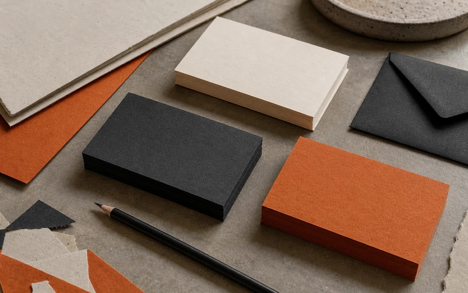
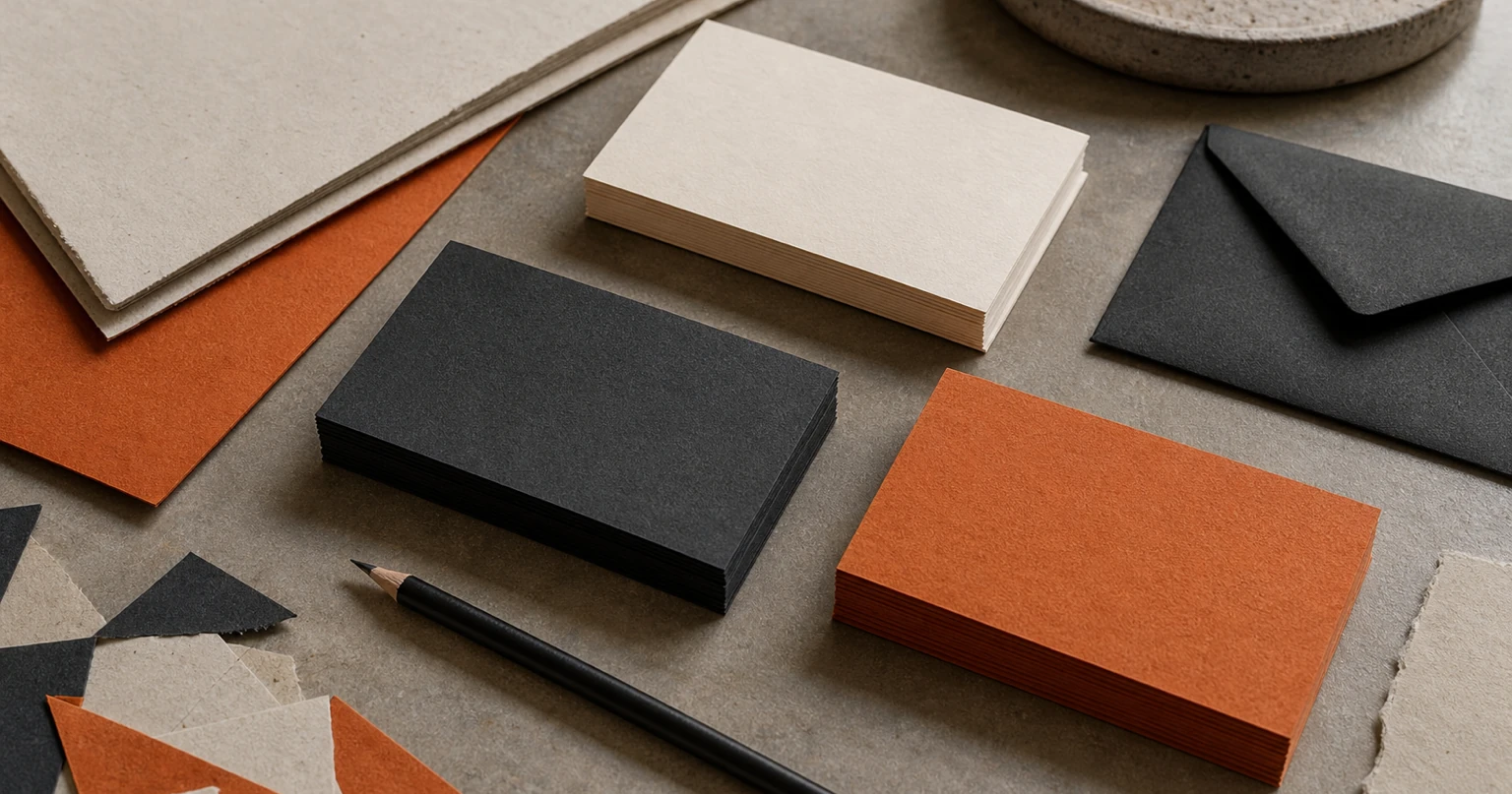
Uncoated stocks often feel natural, tactile and understated. They work particularly well for brands that want warmth, craft or a more editorial feel. Coated stocks can make photography and strong colour appear sharper. Soft-touch laminates can feel smooth and modern, while a textured stock can add character without shouting.
Ask a printer for samples rather than making the decision from a screen. Feel the weight. Look at the way black text prints. Check the reverse side. Try writing on it if someone may use the card for notes or appointment details. The material needs to suit the use.
A few print basics are worth knowing:
- Use high-resolution artwork and keep logos as vector files where possible.
- Allow bleed around the edges so the printer can trim the card cleanly.
- Keep important text away from the trim edge.
- Check colours on a printed proof, especially dark blues, deep greens and saturated reds.
- Decide whether the card needs a writable surface before adding laminate.
- Order a short test run if you are unsure about the stock or finish.
This is one reason to work with a business card design specialist rather than treating print as an afterthought. A good design file is not only attractive; it is set up to print properly.
Should You Put a QR Code on a Business Card?
A QR code is useful when it removes friction. It is not useful just because it is modern.
Good destinations include a simple contact card, a booking page, a portfolio, a menu, a quote request form or a page made specifically for event follow-up. The destination should work well on mobile and make sense to someone who has just met you.
Avoid sending people to a crowded homepage with no obvious next step. Avoid codes that lead to a page you may change or remove next month. And do not let the code become the main visual feature unless scanning it is genuinely the card’s central action.
A small line of copy helps. Instead of leaving a mysterious square in the corner, say “Scan to save my details” or “Scan to book a call”. That tells the person why they should bother.
You should still include a readable contact route. Not everyone wants to scan a code, and a business card should remain useful even when the camera app stays closed.
Make the Card Part of a Wider Brand System
The card should not be an isolated project. If it has one shade of blue, one version of the logo and one tone of voice, while the website uses something else, it will make the business feel less joined-up.
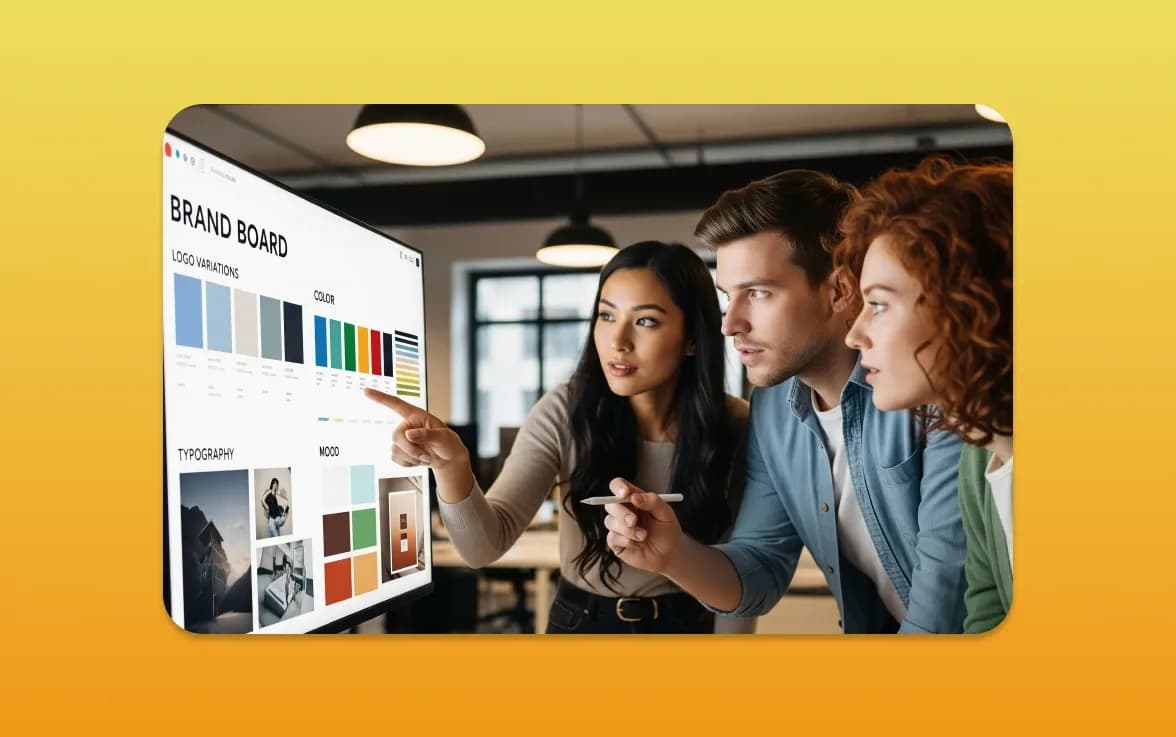
Your brand guidelines should answer the small questions that otherwise get reinvented every time: which logo version to use, how much space it needs, what fonts are approved, how colours are specified and what kind of imagery or illustration belongs to the brand.
This is not bureaucracy. It makes practical jobs faster. When you need a card for a new hire, an event badge, a letterhead or a supplier sign, you already know the rules.
If you are unsure where to begin, read our guide on what logo design can cost for a UK business. It explains why a logo is more useful when it is designed to work across real applications, rather than only as a social-media profile image.
A Sensible Way to Brief a Designer or Printer
Bring useful information to the first conversation. It will improve the result and reduce unnecessary rounds of change.
Share your logo files, brand colours, fonts and any existing guidelines. Explain the audience, where the card will be handed out and what you want people to do afterwards. Provide the correct contact details and confirm who needs a card. If there are multiple team members, decide whether every card follows the same layout.
It is also helpful to bring examples. Not so the designer can copy them, but so they understand the level of restraint, material quality or personality you are drawn to.
Then ask for a proof. Read every line. Check the phone number. Visit the QR destination. Hold a printed sample if possible. The cost of catching an error before the run is tiny compared with reprinting hundreds of cards with the wrong email address.
Print Something People Will Keep
A business card should make it easy for a good conversation to continue.
Keep the layout clear. Use good materials for a reason. Make the next step obvious. Most importantly, make sure the card feels like the business someone has just met: capable, consistent and worth remembering.
If your existing cards feel dated, cluttered or disconnected from your website, get in touch with MattDarm. We can help you create a card and a wider print design system that looks good in the real world, not just in a mock-up.