
Key Takeaways
- The most useful logo trend for 2027 is a logo that still works when it is tiny: in a browser tab, on a phone's home screen or in a round social media avatar.
- Responsive logo sets, with a full version, a shorter version and a simple mark, are likely to become the normal way small businesses brief a designer.
- As AI-made logos and copy start to look alike, a human brand voice and a distinctive idea are worth more than ever.
- Illustration, mascots and bolder colour can make a small brand memorable, as long as they stay readable and consistent.
- Do not rebrand just to follow a trend. Change your identity when your business has changed, not when the fashion has.
Most branding trend lists show glossy concept work for brands that do not exist. This one is written for UK business owners who need a logo and identity that work hard on a website, a van, a social profile and an invoice.
We have sorted the trends we expect to matter in 2027 into three groups: the ones worth using, the ones worth testing carefully and the ones best skipped. These are our views on where branding is heading, not certainties.
One test applies to all of them. A branding trend is only useful if it helps the right customer recognise you, remember you and trust you. If it does none of those things, it is decoration.
Trends to Use in 2027
These five are low risk. They make a brand easier to recognise in more places, and they age well.
1. Logos That Work at Tiny Sizes
Your logo now spends much of its life very small. It sits in a browser tab, next to your listing in search results, on a phone's home screen and inside a round social media avatar. A detailed logo with a long name and a fine tagline turns into a smudge at that size.
Google shows a small icon, called a favicon, beside your site in its results. Google's favicon guidelines ask for a square image that represents your brand and recommend one larger than 48 by 48 pixels. That is a good test for any logo: does it still say "you" in a small square?
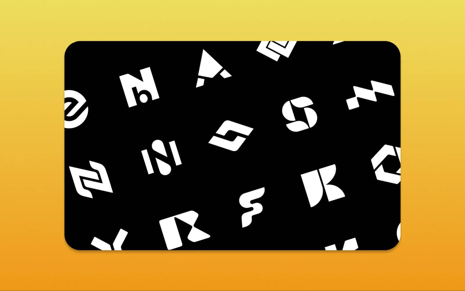
In practice, this means designing a simple mark alongside the full logo. It might be an initial, a symbol or a cropped part of the main design. Test it on a phone, on a dark background and inside a circle before you sign it off.
2. Responsive Logo Sets
A responsive logo is a family rather than a single file. A typical set has a full version for your website header and signage, a shorter version for tight spaces and the small mark described above. Each version is drawn to suit its size, instead of shrinking the same artwork until it breaks.
We expect more small businesses to ask for a set like this from the start, because a brand now appears at so many sizes. It also makes life easier for everyone who uses your brand later, from a printer to a web developer. Our guide to the different types of logotype explains how wordmarks, lettermarks and symbols behave when they are scaled down.
Ask for a sensible handover: vector files for print and signage, web-ready files for your website and a short guide showing which version goes where. Our logo design service is built around a set like this.
3. A Human Brand Voice
AI tools have made it easy to produce a logo, a tagline and a page of copy in minutes. The result is a growing number of brands that look and sound the same: similar gradients, similar symbols and the same vague promises about passion and excellence. Our article on why AI logos look the same explains why this happens.
That sameness makes a human voice stand out. Write the way you and your team actually talk to customers. Use the words your customers use when they describe their problem. Say plainly what you do, who it is for and what makes you different. Our guide to writing brand copy that sounds human has practical examples.
AI can still help you draft, check and tidy your words. The point is that the ideas, the opinions and the personality should be yours.
4. Illustration and Mascots
Custom illustration and mascots are one of the strongest ways for a small brand to be remembered. A friendly character or a set of drawings can carry a personality that a stock photograph never will. They also travel well across social posts, packaging, vehicle graphics and website pages.
The important word is custom. A generic illustration pack used by thousands of other companies will not set you apart. Agree a simple drawing style, a limited colour palette and a few rules for how the mascot or illustrations appear. That keeps them consistent as more people start to use them.
5. Bolder Colour
We expect more brands to move away from safe greys and corporate blues towards stronger colour. A distinctive colour can become almost as recognisable as the logo, and it helps you stand out in a crowded social feed.
Bold colour still has to be readable. The web accessibility guidelines set minimum contrast ratios for text. Logos and brand names are exempt, but the brand colours you use for headings, buttons and body text are not. Choose a palette with at least one dark and one light colour that work well together, and test them early. Our guide to colour psychology in branding can help you choose.
Trends to Test Carefully
These four can work well for the right business. They can also cost more than they return. Try them in one place first and keep them only if they help.
6. Motion Logos
An animated logo can add life to a video intro, a social post or the moment a website loads. Short, simple motion works best: a mark that draws itself, letters that settle into place or a small wave from a mascot.
Keep it brief, and make sure the still version stands on its own, because most places your logo appears will never move. On a website, respect the reduced motion setting that some visitors turn on in their phone or computer. Our guide to animated logos and motion branding covers when it is worth the cost.
7. Custom Lettering and Expressive Type
Large brands often commission their own typefaces. For a small business, a wordmark with custom lettering, paired with a well-chosen standard font for everything else, is a more realistic route. It gives the logo character without making every document hard to produce.
Before you commit to any font, check that its licence covers your website, print and any app or software you plan to use it in. Make sure the font files are part of your handover, so you are not stuck when you change designer.
8. Retro and Nostalgic Styles
Styles from earlier decades keep coming back, from hand-painted signwriting to bold seventies type. They can work very well for a business with real heritage, such as a long-established family firm or a traditional trade.
They can look forced on a brand with no link to that past. Ask whether the style tells a true story about you, or whether it simply looks good on a design showcase this year.
9. Stripped-Back Minimalism
Simple, flat logos are easier to use at small sizes, which fits the first trend on this list. The risk is that a very minimal logo becomes anonymous. If your mark could belong to an accountant, a gym or a software company, it is probably too plain. Keep one distinctive idea, whether that is a shape, a colour or a piece of lettering.
Trends to Skip
Some ideas sound modern but cause more problems than they solve. We would leave these alone in 2027:
- A trend-led rebrand with no business reason. If your customers recognise you and your brand still fits what you do, a refresh may be all you need. Our comparison of a brand refresh and a full rebrand helps you decide.
- A logo straight from an AI generator, used without checks. It may look like other logos, and you may not be able to protect it. Search existing marks before you commit to a new name or logo, and read GOV.UK's guidance on registering a trade mark. This is general guidance, not legal advice.
- Fine detail, thin lines and taglines inside the logo. They disappear at small sizes and on embroidery, vinyl and screens.
- Borrowing a big brand's look. It makes you look like a copy, and it can confuse customers.
- A different colour or style on every channel. Consistency is what makes people recognise you. A trend that breaks it costs you more than it gives.
A Quick Way to Judge Any Branding Trend
Before you add a trend to your brand, ask these five questions.
| Question | Why it matters |
|---|---|
| Does it still work in a small square, such as a favicon or avatar? | Many people meet your brand at that size first |
| Would a regular customer still recognise us? | Losing recognition costs you trust you have already earned |
| Does it say something true about our business? | A style that does not fit your story looks borrowed |
| Can it be used consistently by everyone who represents us? | A brand only works if it looks the same everywhere |
| Will it still make sense in five years? | A logo should outlast the trend that inspired it |
Here is a fictional example. A family-run plumbing firm in Oxfordshire feels its logo looks dated. Instead of a full rebrand with a fashionable gradient, it keeps its name and its recognisable colour. It has the logo redrawn so it reads clearly on a van and in a small social media avatar, adds a simple tap symbol for its favicon and introduces a friendly illustrated character for social posts. It also rewrites its website introduction in plain, everyday language. Existing customers still recognise the business, and new ones remember it.
What This Means for Your Brand in 2027
If you are planning a new identity or a refresh in 2027, start with your business, not the trends. Decide what has changed, who you want to attract and where your brand appears most often. Then choose the trends that support those goals.
A brand identity design project gives you a logo set, colours, type and simple rules that work everywhere. If your brand works but feels tired, a brand refresh or rebrand can update it without losing the recognition you have built. For comparison, you can still read last year's logo design trends and our wider look at branding trends for 2026.
If you are thinking about your brand for 2027, tell us about your business. Send us your current logo and where you use it, and we will tell you which of these trends are worth your budget and which you can safely ignore.
Frequently Asked Questions
What are the biggest logo design trends for 2027?
We expect the most useful trends to be logos that work at tiny sizes, responsive logo sets, a human brand voice, custom illustration and mascots, and bolder colour. Motion logos, custom lettering, retro styles and minimalism can also work, but they are best tested first.
Should my small business rebrand in 2027?
Only if your business has changed. Good reasons include a new service, a new market, a merger or a logo that no longer works on screens. If customers still recognise and trust your brand, a careful refresh is often enough.
Can I use an AI-generated logo for my business?
You can, but there are risks. AI logos often look similar to others, and it may be hard to protect one as a trade mark. Check existing marks before you commit, and speak to a qualified adviser about your own situation. This is general guidance, not legal advice.
What logo files should I get from my designer?
Ask for vector files for print and signage, web-ready files in several sizes, versions for light and dark backgrounds, the small mark or favicon and any font files or licences. Our guide to brand identity handover files explains what to ask for and who should own it.
How do I know if my logo works at small sizes?
Put it in a browser tab, set it as a social profile picture and view it on a phone at arm's length. If you can still recognise it straight away, it works. If the name or details blur, you need a simpler mark for small spaces.