
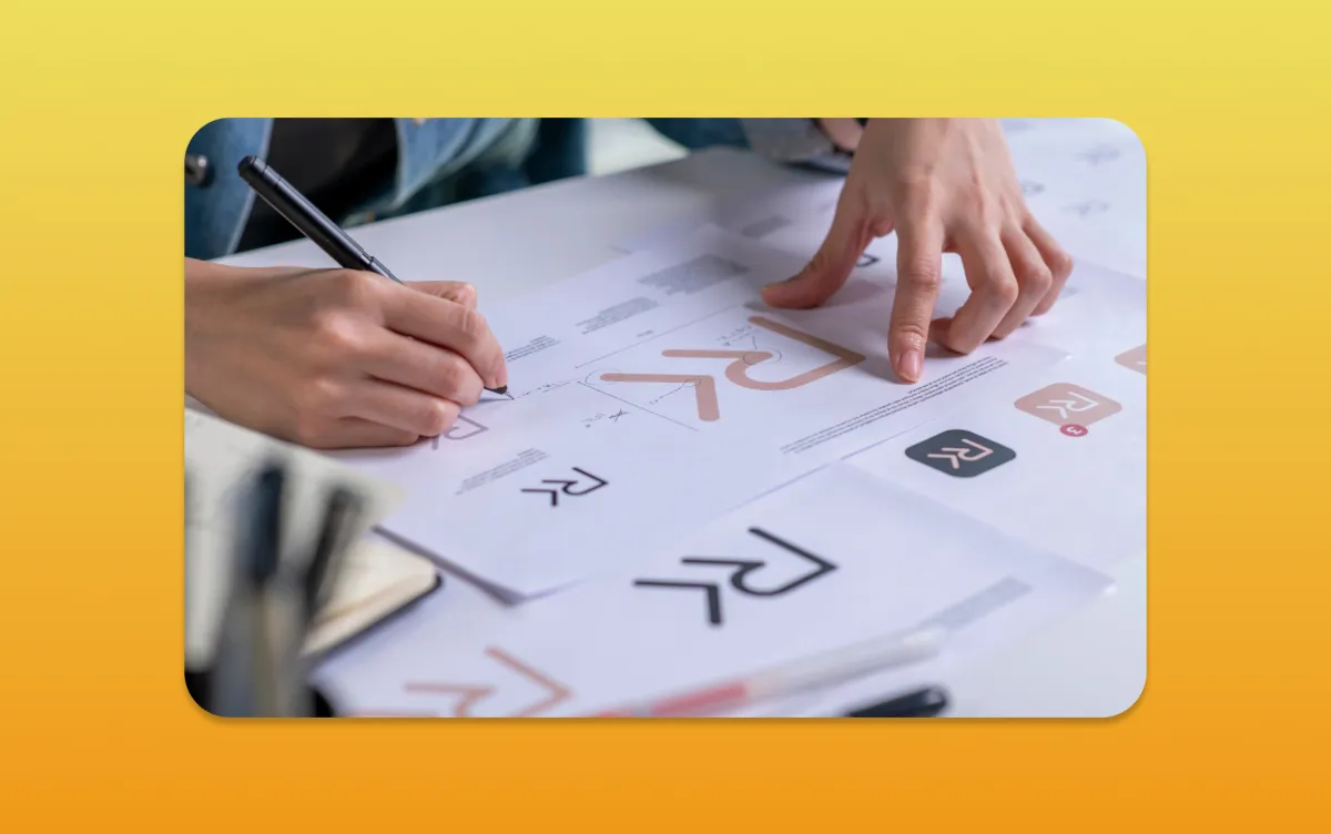
Key Takeaways
- A useful logo is recognisable and workable at the sizes customers actually see.
- Colour and type choices need context; they do not guarantee a particular emotion or result.
- Test the identity across real applications before approving the design.
- Check rights, licences and trade-mark risk separately from visual preference.
Your brand’s logo is like a signature – a symbol that makes you recognisable. Think about the apple with a bite out of it; that’s Apple’s logo. It’s simple yet unforgettable.
A well-crafted logo is more than just a pretty picture; it’s a representation of your brand’s identity and values. Let’s explore how a memorable logo can make your brand stand out and be remembered by your audience.
When creating a lasting impression, consider a few key aspects. A logo should resonate with your target audience, reflect your brand’s personality, and set you apart from the competition.
The Importance of a Memorable Logo
A logo is more than just a visual symbol. It’s a key part of a company’s brand strategy and identity. It’s often the first thing people see, making a big impact on how they feel about your brand.
Emotional Connection and Branding
A good logo can make people feel something. It creates a personal bond with your audience. This bond is essential for building loyalty and making your brand stick in their minds.
- Establishes brand identity
- Fosters emotional connections
- Distinguishes your brand from competitors
Recognition and Recall
A logo that stands out is key to a brand’s success. A simple yet unique logo can greatly boost recognition.
What makes a logo memorable includes:
- Uniqueness of design
- Colour scheme and typography
- Consistency across branding materials
Simplicity in Design
Simplicity is key in logo design. A simple logo is easier to remember and works well in many places.
- Enhances memorability
- Improves scalability
- Supports versatility across different media
Key Elements of Effective Logo Design
To make a logo that connects with your audience, focus on key elements. A good logo is more than just pretty; it’s a mix of design parts that share your brand’s message and values.
Let’s explore what makes a logo truly stand out.
Colour Psychology
Colour can help distinguish an identity, but meaning depends on context, culture and the surrounding design. Blue does not automatically create trust, and green is not evidence of environmental performance. Evaluate the palette against the business's positioning, competitors and practical applications.
Separate brand colour from functional interface colour. A website still needs readable text, visible focus and understandable error states. The GOV.UK Design System's colour guidance is a useful example of assigning colour to a defined purpose; it is not a palette every business should copy.
Typography Choices
Judge the actual letterforms, spacing and legibility rather than assuming every serif feels traditional or every sans serif feels modern. Check the business name at small sizes, on signage and in the relevant language. Confirm font licensing for the uses you plan, including any editable templates supplied to the client.
Symbolism
Symbols and icons add depth and meaning to your logo, making it memorable and impactful. Good symbolism conveys complex ideas simply and clearly. In Professional Logos, designers use symbols that reflect the brand’s mission, values, or industry. This turns the logo into a storyteller.
Understanding Your Target Audience
Start with the buying situation and the places the identity will appear. A customer comparing professional suppliers may need a clear, credible name more than an elaborate symbol. A retailer may need a mark that remains recognisable on packaging, signs and small social crops.
Use customer interviews and competitor review to understand the setting. Avoid treating age, gender or income as a formula for visual taste. Ask participants what they recognise, what they can read and what they think the business offers. Their observations are more useful than a vote for a favourite colour.
Record the brief before presenting concepts: the intended audience, positioning, practical formats and any existing recognition worth preserving. That gives the review a shared basis and reduces the temptation to choose a design only because it follows a current trend.
The Role of Versatility in Logo Design
A logo’s versatility is key to representing a brand well. It should work in many places, like business cards and billboards. It also shines on digital platforms like social media.
Let’s look at what makes a logo versatile. This ensures it stays impactful, no matter where it’s used.
Scalability for Different Formats
A logo must look good in all sizes. It should be clear on small business cards and large billboards. Designers use vector formats like SVG or EPS for this.
- Use vector graphics for scalability.
- Avoid too much detail that gets lost when scaled down.
- Test your logo in various sizes to ensure it remains legible.
Adaptability Across Platforms
In today’s world, logos must fit different platforms. This includes social media, websites, and merchandise. They should look good in different settings, like various backgrounds and sizes.
For adaptability, design a logo that’s simple yet distinctive. It should be easy to spot, even in different colours or orientations.
Consistency in Branding
Consistency is vital for a strong brand. A versatile logo keeps your brand look the same everywhere. This helps your brand’s message stick with your audience.
To keep things consistent, create a brand guideline. It should cover logo usage, including colours, typography, and size.
The Creative Process Behind Logo Design
Exploring the creative process of logo design, we see how designers craft logos. It’s a big task, best handled by a professional. A well-designed logo can really boost a brand.
Brainstorming Ideas
The first step is brainstorming ideas. This is where creativity and strategy meet. I research the client’s industry and their audience. I also look at competitors to find unique ideas.
I write down every idea, no matter how crazy it seems. This is the start of creating something special.
Sketching and Prototyping
Next, I sketch and prototype my ideas. This is when I bring my concepts to life. I play with different designs, colours, and symbols.
Using design software, I create digital versions of my sketches. This lets me refine the design. I make sure it looks good and works well in different sizes.
Gathering Feedback
Getting feedback is key in logo design. I share my designs with the client and listen to their thoughts. This feedback helps me make sure the design is right.
It’s also a chance to tweak the design until we’re both happy. This feedback loop is essential for a great final design.
By following this process, I create logos that are not just beautiful but also represent the brand well. Whether you need a new logo or a refresh, understanding this process can help you value the effort that goes into creating a memorable logo.
Common Mistakes in Logo Design
Logo design is key for any business wanting a strong brand. But, many make mistakes that harm their logo’s impact. It’s vital to avoid these errors and follow good design rules.
Overcomplicating the Design
One big mistake is making logos too complicated. A cluttered logo is hard to remember. A simple design is better for sticking in people’s minds.
- Avoid using too many colours or fonts.
- Steer clear of overly complex graphics.
- Opt for a simple, yet distinctive design.
Ignoring Cultural Sensitivities
Check symbols, language and visual associations in the markets where the identity will be used. Avoid broad assumptions about entire regions or cultures. If an interpretation could be sensitive, obtain informed local feedback rather than relying on a generic colour-meaning chart.
Neglecting Target Demographics
Not considering your target audience can also fail. Understanding their likes and values helps create a logo that appeals to them. Research your audience well.
- Identify your audience’s age, location, and interests.
- Understand their preferences and values.
- Design a logo that speaks to these insights.
Don’t follow trends too closely. Aim for a unique, timeless logo. By avoiding common mistakes and focusing on simplicity, cultural sensitivity, and demographic relevance, you can create a lasting logo.
The Impact of a Strong Logo on Business
A logo can help people identify the business and connect different touchpoints. It cannot compensate for unclear services or poor delivery, and a new mark does not by itself establish a sales increase. Recognition develops through repeated, coherent use and the experience associated with the business.
Decide what you can observe: whether the name is legible, whether customers confuse the mark with another supplier, and whether staff can use the assets correctly. If you later measure commercial changes, record the period and other influences rather than attributing every improvement to the logo.
Hiring a Professional Logo Designer
Having a professional designer is a big plus. They know all about making your brand look good. They can help you make a lasting impression.
Start by checking out the designer’s portfolio. Look for a variety of styles and a good grasp of branding. It’s also important to find someone who listens and offers good advice.
Key Considerations
When you’re setting a budget for a logo designer, think about the long-term benefits. A good logo can really connect with your audience. A professional can make sure your logo is top-notch and fits your business.
Remember, the cost of a logo is just the beginning. Think about how a strong brand can help your business grow. With the right planning and partner, you can get a logo that perfectly represents your brand.
A practical logo review before sign-off
Prepare a small set of real applications: a website header, a mobile profile crop, a business card, a document and any relevant sign or product label. Use realistic sizes and backgrounds. A logo shown large in the centre of a presentation slide has not yet passed those tests.
Check the wordmark first. Can a person unfamiliar with the business read the name without help? Look at ambiguous letters, spacing and any decorative feature that becomes confusing when reduced. If there is a separate symbol, check whether it remains useful without assuming a new audience already recognises it.
Then test a one-colour version and the approved light and dark treatments. Confirm that important details survive the production methods you actually use. Embroidery, small print and illuminated signage can place different constraints on fine detail. Ask the relevant supplier for production specifications before approving an application.
The W3C's accessible-design guidance is relevant to the identity's digital applications. A brand system must leave room for readable text, visible controls and accessible layouts. Do not use the fact that a logo is a special graphic as a reason to ignore accessibility in the surrounding page.
What a delivered identity looks like
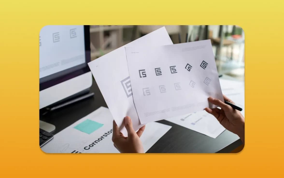
For Cornwall Flooring & Home Co., the work included the logotype, palette, typography and guidelines, with applications across cards, signage, social visuals and clothing. This shows why the logo decision needs to be tested as part of a system rather than as an isolated image.
The project is evidence of those deliverables. It does not establish that navy and gold universally communicate quality or that a new identity produced a particular sales result. The useful lesson is the connection between a core design and the materials customers encounter.
Check rights and handover separately
Search for potentially conflicting marks and obtain appropriate advice where needed. The UK trade-mark search service is a starting point, not a complete legal clearance opinion. A visually original design and a registrable trade mark are different questions.
Agree the final file formats, usage rights, font licences and source-file handover. Ask for clear naming and guidance on which version to use. The brand style-guide article explains how to document this, while the identity-versus-strategy guide helps define the wider brief.
MattDarm offers logo design and brand identity design. Share the business context and applications you need so the proposal can cover the actual work, not just a number of initial concepts.
Frequently Asked Questions
Does a memorable logo have to be simple?
Clarity and workable detail matter, but simplicity alone does not make a mark distinctive. Test the actual name, shape and applications rather than treating minimalism as a universal formula.
Which colour makes customers trust a brand?
No colour guarantees trust. Meaning depends on context, culture, contrast and the wider identity, while trust also depends on the business's behaviour and delivery.
How should we test a proposed logo?
Use realistic applications and sizes, including mobile, print and any signage. Check legibility, contrast treatments, one-colour use and potential confusion with other businesses.
Is a logo the same as a brand identity?
No. The logo is one element of an identity that can also include typography, colour, imagery, voice and application rules. Strategy defines the wider positioning those choices should support.
Does a trade-mark search guarantee we can use the logo?
No. A search is a useful starting point but not a complete legal clearance. Obtain appropriate advice for the intended markets and uses, and separately agree design and font rights.