

The brief, the decisions and the delivery
One visual identity, from the shopfront to the social feed
The challenge
Cornwall Flooring and Home Co. needed a premium visual identity that could work beyond a logo file. Customers encounter the business through a shopfront, printed materials, social profiles and the people representing it. Each format has different production constraints. The design task was to build one recognisable system that remained usable across those touchpoints, with guidance for the team producing the next piece of communication.
Create the core identity as a system
The work established the main logotype, colour palette and typography together. This gave subsequent applications a consistent starting point. A business card, social post and sign do not need identical layouts, but they should not require a different interpretation of the business each time.
Test the identity in actual customer touchpoints
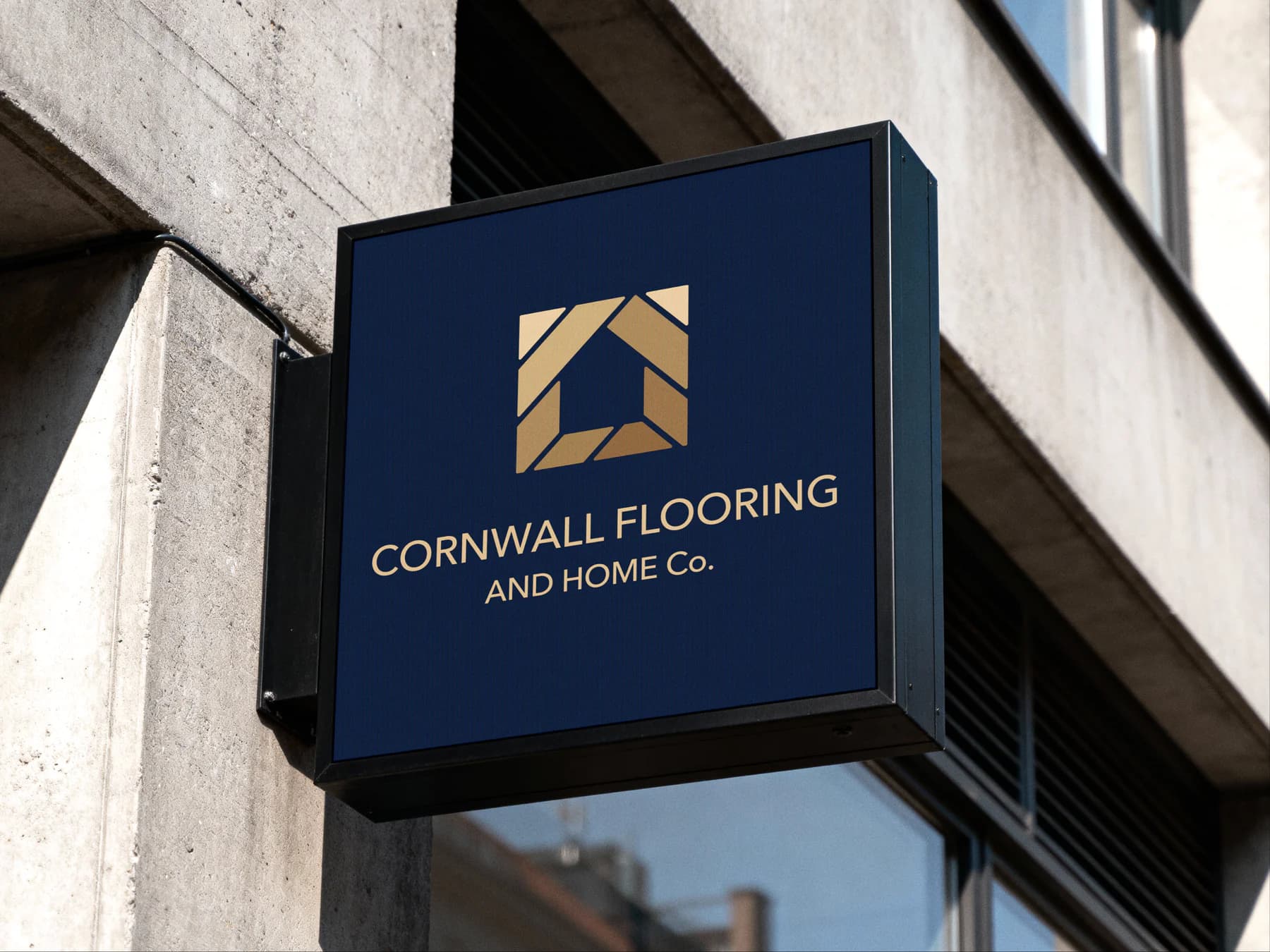
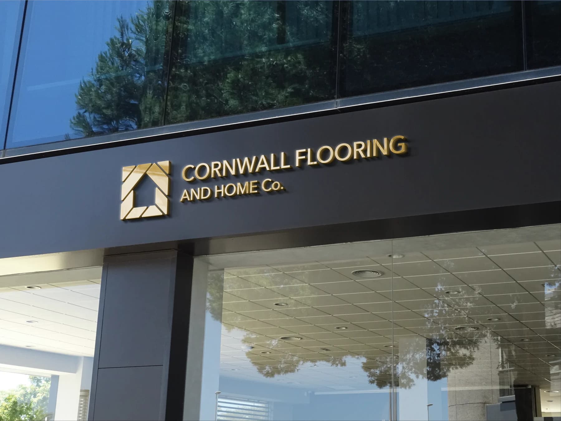
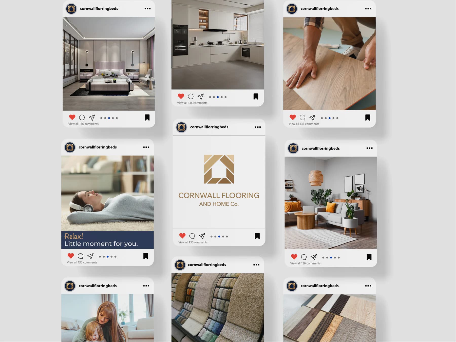
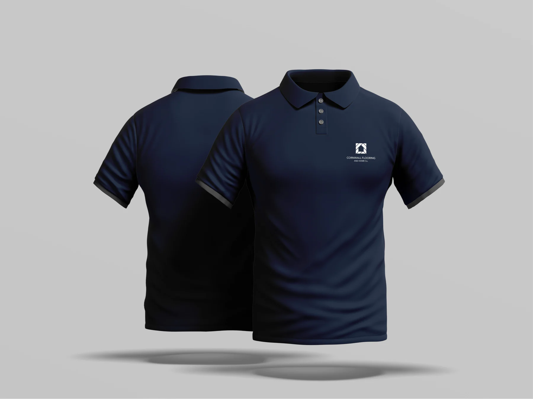
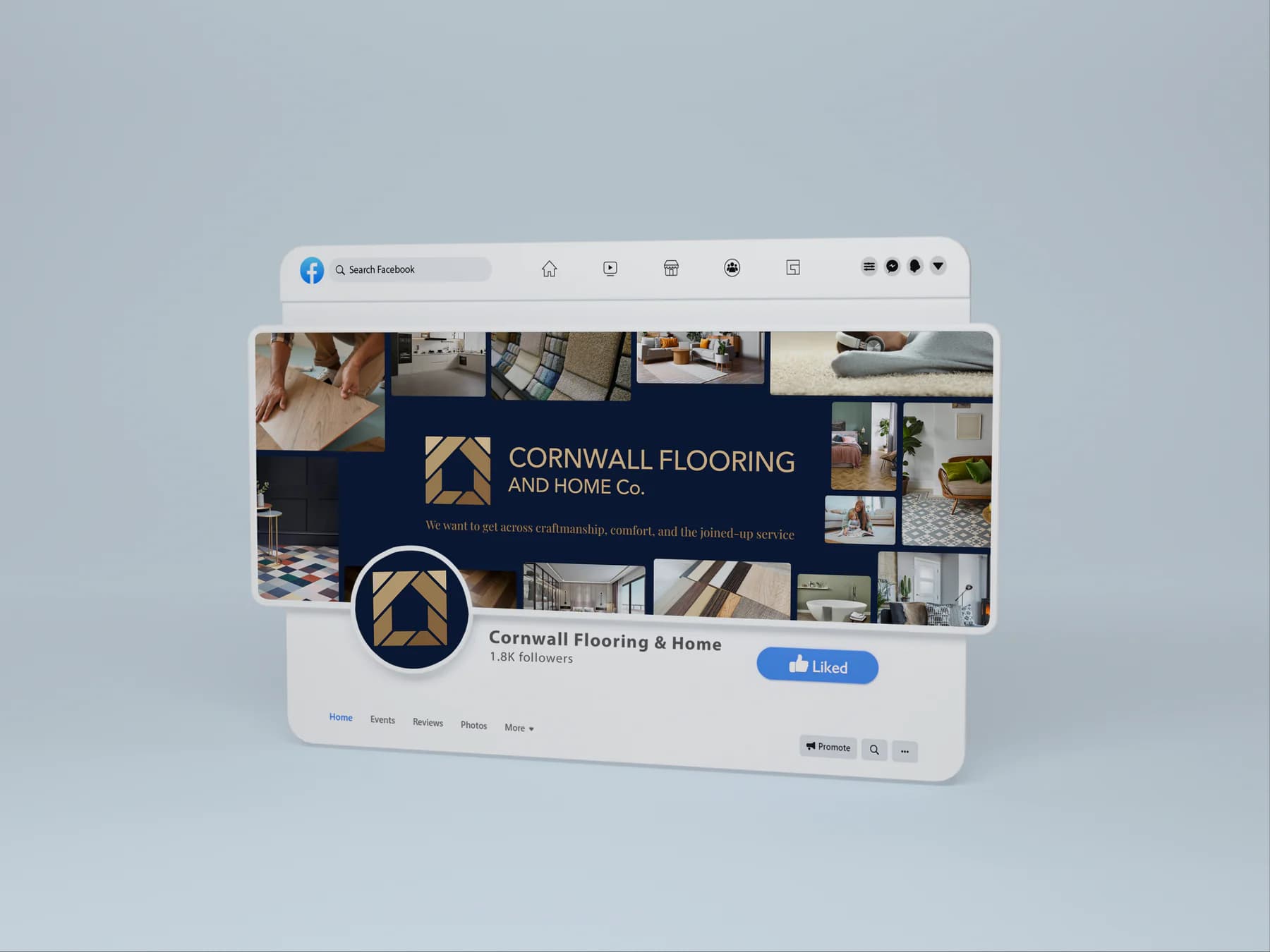
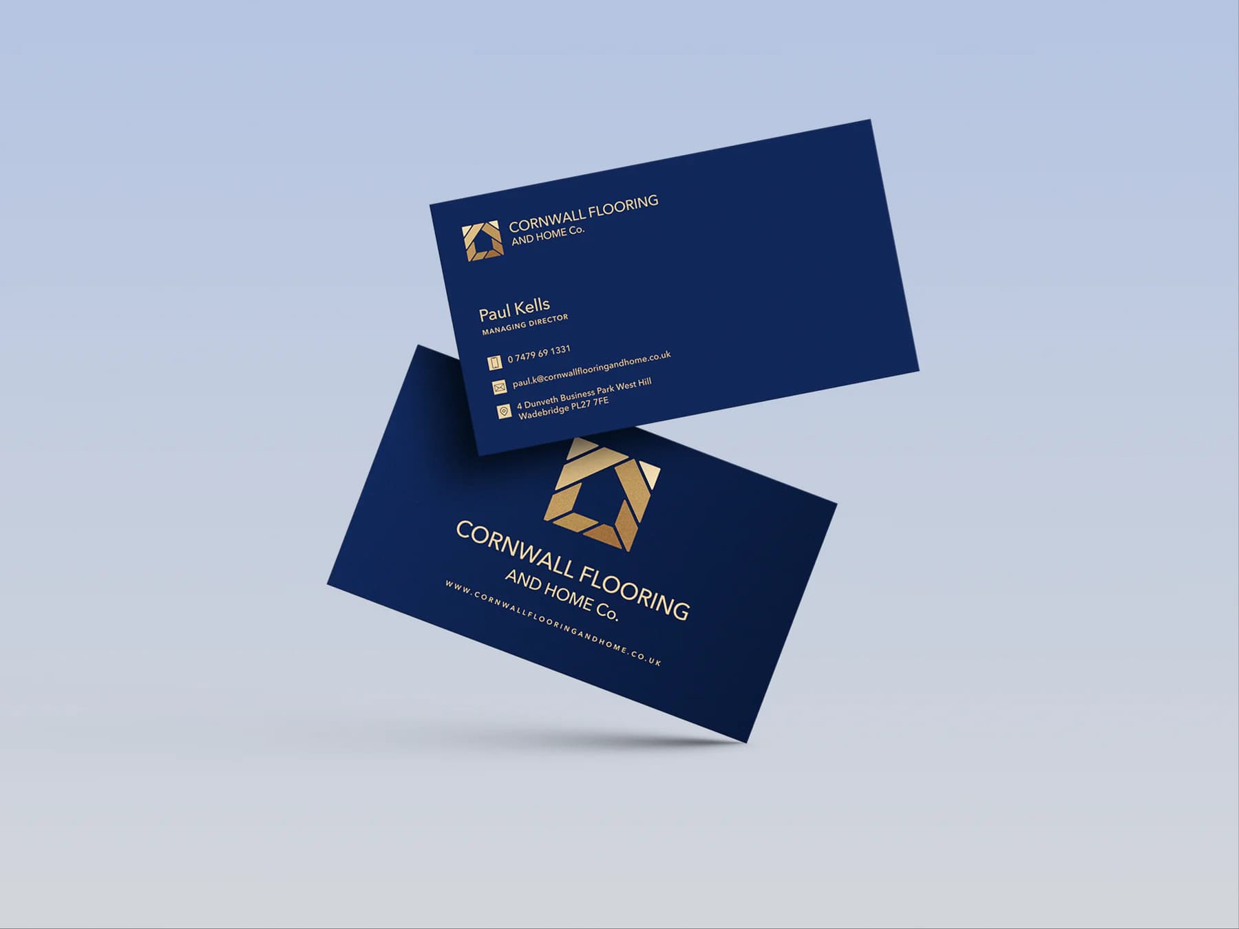
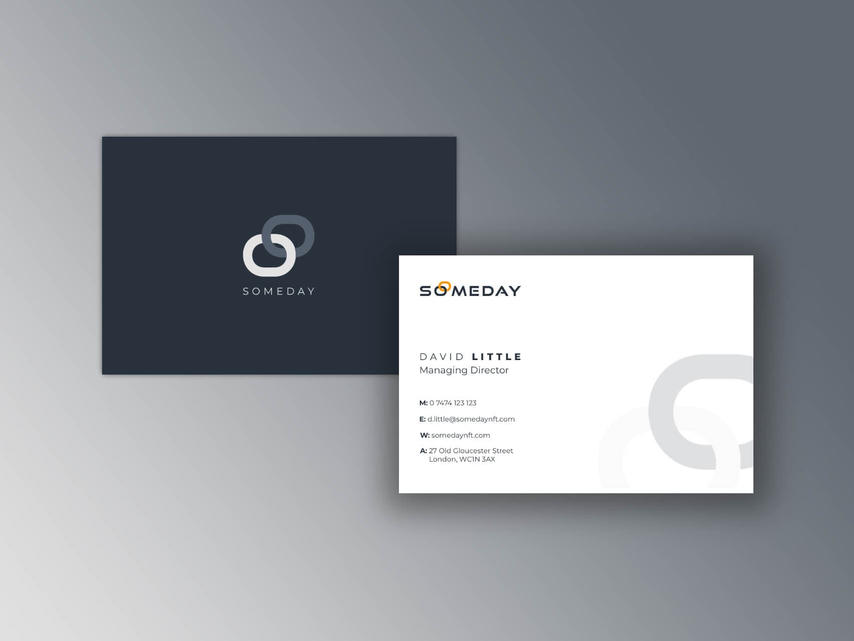
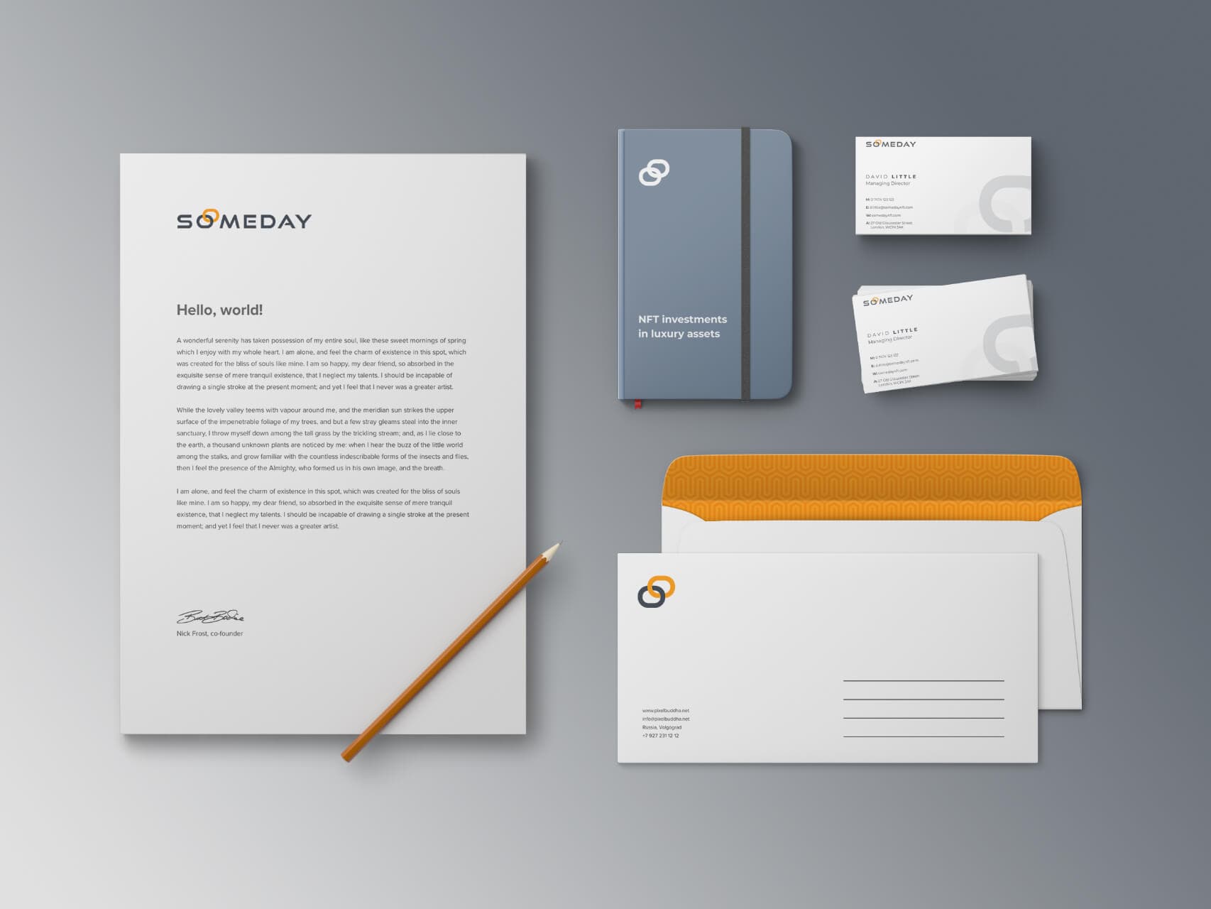
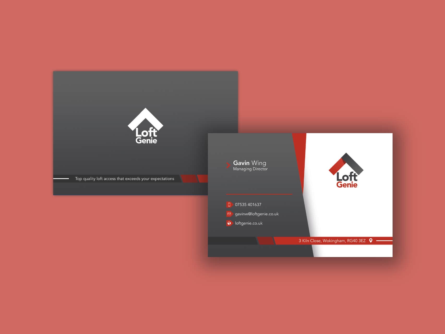
The identity was carried into business cards, shop signage, social visuals and branded team clothing. Those applications matter because a logo viewed large on a designer's screen is not the whole customer experience. The portfolio shows how the visual language changes format while retaining its recognisable features.
Provide guidelines for continued use
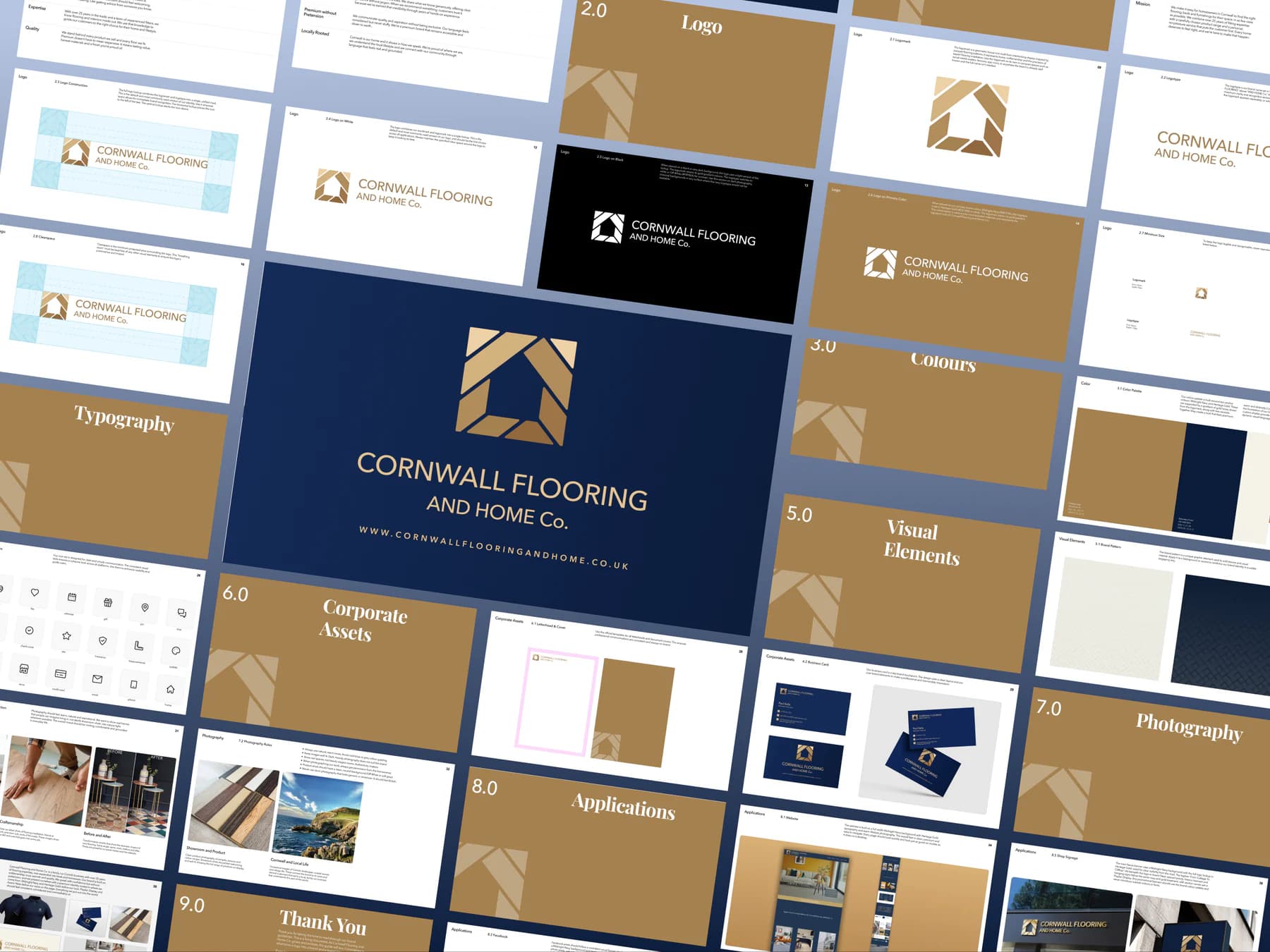
A documented set of brand guidelines accompanied the assets. The purpose is practical continuity: the team and its suppliers need a reference for future materials. This reduces the need to make the same colour, type and logo decisions afresh, although no measured saving in production time is claimed.
Balance a premium presentation with practical use
The navy-and-gold direction is visible across the delivered applications. Its value here is a consistent visual choice, not a universal claim about what those colours make customers feel. The identity needs to be judged in its real setting, at the sizes and on the materials where customers encounter it.
What we delivered
- Main logotype, colour palette and typography
- Brand guidelines and reusable identity assets
- Business-card and shop-signage applications
- Social-media visuals and team-clothing designs
The outcome
The project delivered a connected visual identity and a set of real-world applications, rather than a standalone logo. The gallery documents the guidelines, signage, social assets, clothing and cards. Together these give the business a consistent reference for presenting itself across digital, print and in-person customer contact.
The portfolio assets and delivery record support the scope described here. We do not infer increased sales, customer recognition or a business expansion from the identity work. Those outcomes would need customer research or commercial data collected with the client's permission.
What this means for your project
Before commissioning a logo, identify the first five places it must work. Include those applications in the brief and budget for the guidelines and usable files. That is how an identity becomes something the business can consistently use, rather than a design it can only admire.
Case study updated ·
Related work
More projects in this area


People we've worked with
Real projects, built together
Let’s Grow Your Business Together
Tell us about your project and we’ll show you exactly how we’d grow your business. Book a free 30-minute discovery call, no pressure.