
Print has a particular job that digital cannot quite replace.
A website can explain your offer in detail. Social media can keep you visible. Email can follow up. But printed material puts your brand in someone’s hands, on a wall, in a meeting room, on a shop counter or in a package they have just opened. It asks to be judged at close range.
That is why branding for print deserves more thought than dropping a logo into a template. A business card, a sign, a brochure and an invoice may all be small parts of the same brand, but they each need to work in a different setting. When they do, the business feels more established and easier to trust. When they do not, people notice the disconnect, even if they cannot quite explain why.
This guide is for small businesses that want their stationery, signage and marketing materials to look like they belong together without making print design more complicated than it needs to be.
Key Takeaways
- Print works best when it is part of one clear brand system, not a set of unrelated jobs.
- Good stationery makes everyday communication feel more professional.
- Signage needs to be legible and useful before it is decorative.
- Brochures, flyers and other marketing pieces should give people one clear reason to act.
- Print-ready artwork, physical proofs and practical material choices prevent costly mistakes.
Print Is Still a Real Part of the Customer Experience
Printed material does not need to compete with digital. It has a different role.
A person might first find you through Google, but then receive a quote on branded stationery. They might see your van or shop sign on the way home. They might keep a business card after a meeting, pick up a leaflet at an event or receive a product with a clear instruction card inside the parcel. Each of those moments reinforces the impression created online.
That is especially important for businesses that are building trust. A cleanly presented proposal, a readable sign and a professional card all signal that there is care behind the service. They will not replace good work, but they make it easier for people to believe in the good work before they have experienced it.
The goal is not to print everything. It is to choose the materials that genuinely support your customer journey and make them work hard. One strong, useful printed piece is better than a pile of generic flyers that nobody picks up.
A good print design service starts by asking what the material needs to achieve, where it will live and who will use it. That is a far better place to begin than choosing a finish because it looked good on another business’s card.
Begin With the Brand System, Not the Individual Item
The easiest way to make printed material feel inconsistent is to design each item separately.
Someone creates a card in Canva. A printer supplies a sign layout. A member of the team puts together a PDF leaflet. The invoice uses a different logo version. Nothing is obviously wrong on its own, but together the business looks fragmented.
The answer is not to make every item identical. It is to have a set of shared rules.
At a minimum, those rules should cover:
- Which logo versions are approved and where each one is used
- Brand colours, including their print values
- Heading and body typefaces
- A simple hierarchy for titles, subheadings and contact details
- Image, illustration or icon style
- The tone of voice for short printed copy
- Clear space, margins and layout principles
This is what turns a logo into a usable identity. If you have not done that work yet, a brand identity design project gives your business a visual language that can travel across website pages, stationery, packaging and signage without losing its character.
A brand guidelines document does not have to be a huge book. Even a short, practical guide saves time. It means the next person designing a flyer or ordering a banner does not have to guess at the correct font, colour or logo file.
Stationery: The Quiet Proof That You Are Organised
Stationery is often the least glamorous part of branding, which is exactly why it matters. It appears in the everyday moments where clients make small judgements about the business.
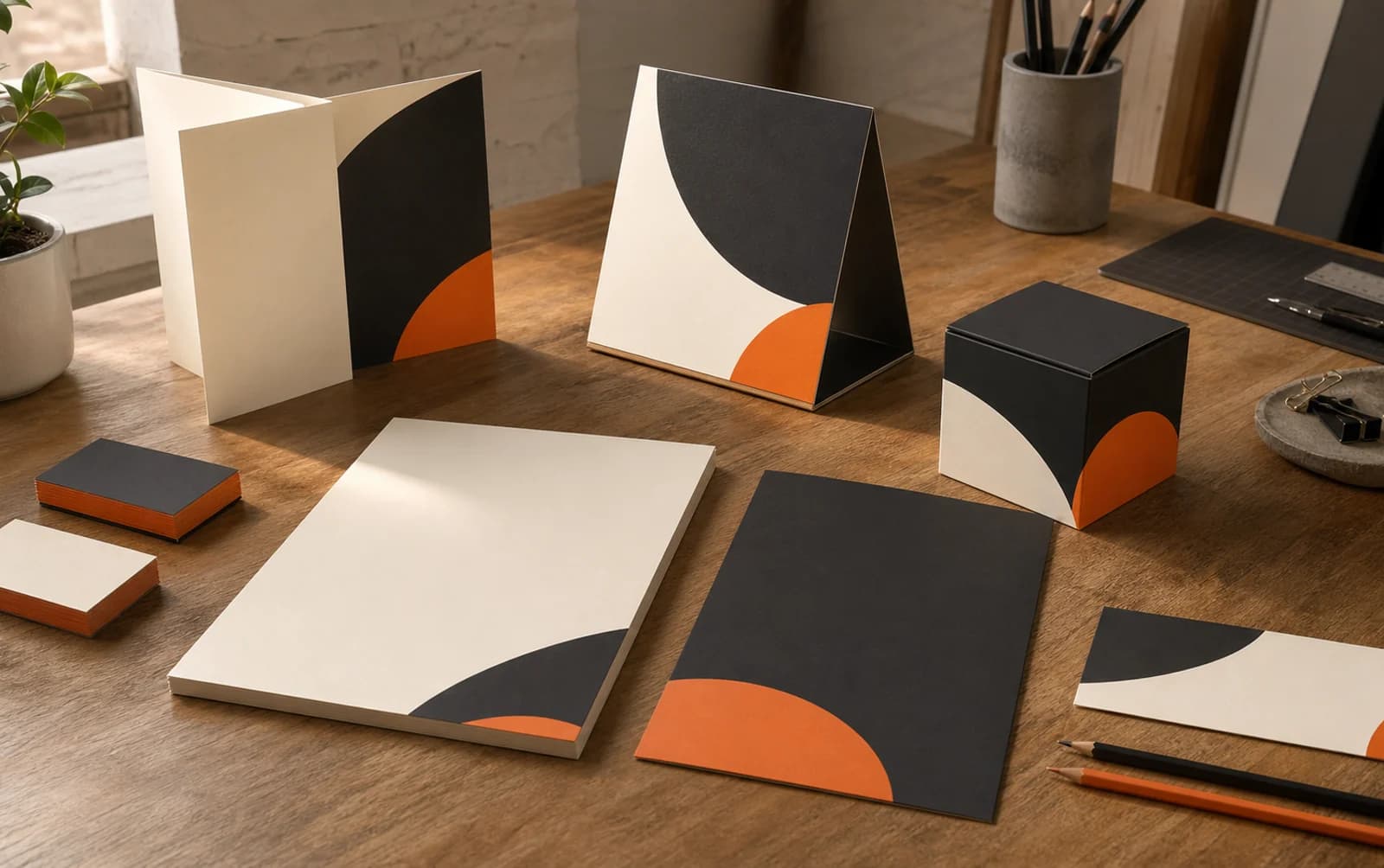
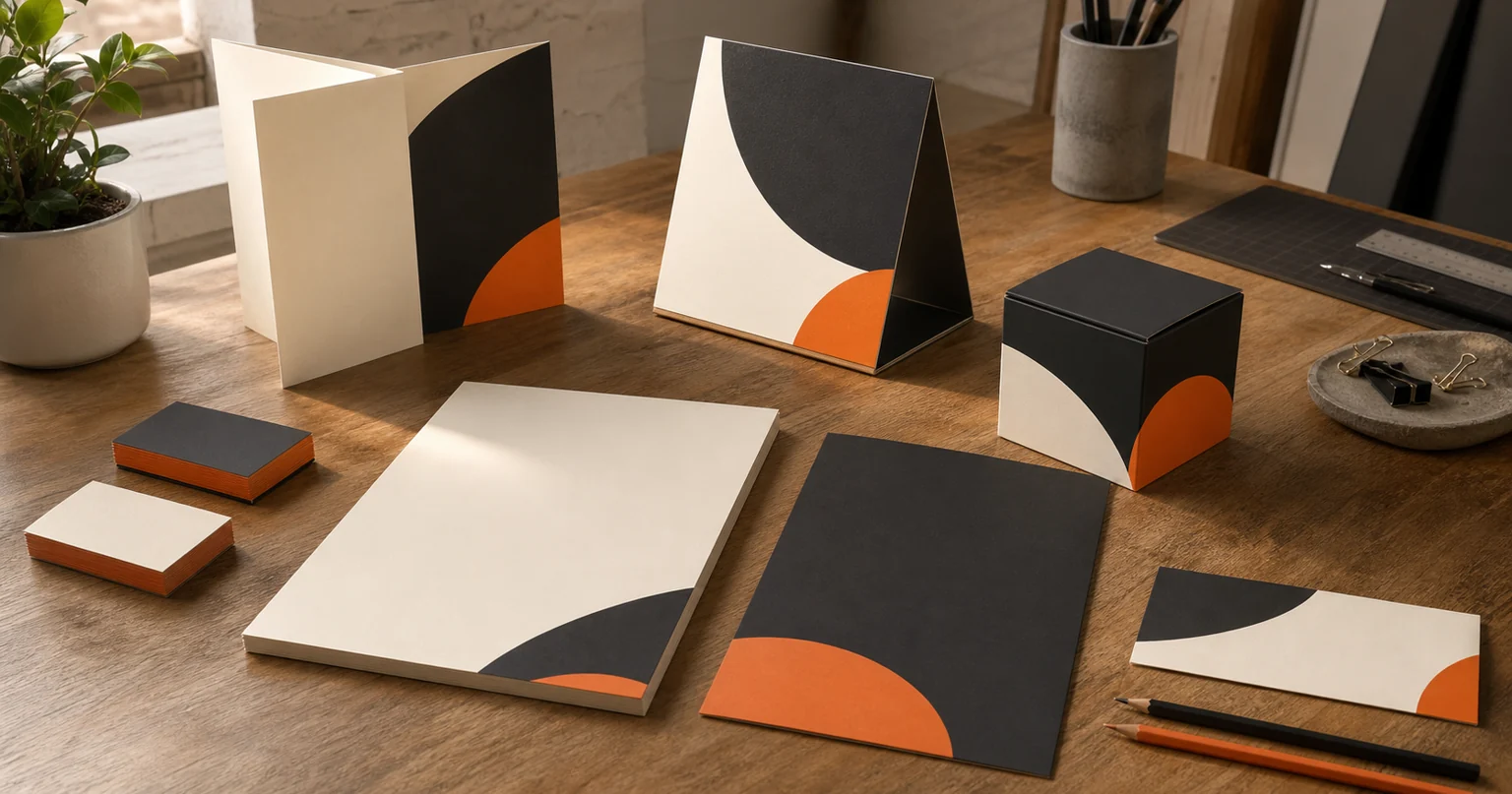
That might include business cards, letterheads, compliment slips, quote templates, proposal covers, invoices, envelopes, folders, appointment cards, thank-you notes and email signatures. You may not need all of them, but the ones you do use should feel connected.
Business cards
A card still works well after an in-person conversation, at a networking event or when a customer wants to recommend you. Keep it clear. The person’s name, the business, a simple role or descriptor and a reliable contact route are usually enough. If you use a QR code, make sure it leads somewhere useful, such as a contact card, booking page or portfolio.
Read our guide to business card design if you are deciding what to include and how to choose a layout that feels professional rather than crowded.
Letterheads, quotes and invoices
These materials do not need to be flashy. They need to be clean, easy to read and trustworthy. A good quote or proposal should put the client’s information, scope, date, price and next steps in the right order. Your logo, typography and colour should support that structure rather than compete with it.
Do not overlook the small details. Consistent page margins, clear file names and a proper email signature all contribute to the same impression. They tell a client that you pay attention before the project has even started.
Appointment and loyalty cards
For salons, clinics, restaurants and local service businesses, an appointment or loyalty card can be genuinely useful. It should be made for the person who will write on it, carry it and refer back to it. That may mean choosing an uncoated stock that accepts ink, leaving enough space for dates or stamps and keeping the information large enough to read quickly.
The job comes before the decoration.
Signage: Help People Find, Understand and Remember You
Signage is a practical design discipline. A beautiful sign that people cannot read from the pavement is not doing its job.
Start by thinking about distance and context. A shop fascia needs to work for somebody walking past and somebody looking from the other side of the road. An A-board needs to be understood in a few seconds. Directional signage needs to help visitors make decisions without stopping. Window graphics may need to communicate opening hours, services or a booking route without blocking the view inside.
A few questions make a real difference:
- How far away will someone be when they first see the sign?
- Are they walking, driving or already inside the premises?
- What is the light like during the day and after dark?
- What information must be read first?
- Is there a planning, landlord or site requirement to consider?
- Will the sign be temporary, seasonal or in place for years?
Size and contrast matter more than clever wording. A short message in a strong typeface can be read. A busy paragraph usually cannot. Choose colours that have enough contrast in the real environment, not just on a bright design screen.
The same goes for vehicle graphics, exhibition panels and internal signs. They should use the brand system, but they should never sacrifice clarity for style. If your business has several locations or a more complex space, create a simple hierarchy: the main sign tells people where they are, then secondary signs help them navigate.
Marketing Materials: Give People a Reason to Take the Next Step
A flyer, brochure or postcard is most useful when it gives somebody a clear next move.
The common mistake is trying to explain everything about the business on one sheet. A better approach is to decide what the item is for. Is it announcing a launch? Introducing a local service? Supporting an event? Explaining one offer? Giving a sales team something to leave behind after a meeting?
Once you know the answer, write and design around it.
Flyers and postcards
These work best with one main message, one visual idea and one call to action. A short offer, an event date, a service benefit or a simple invitation can be enough. Keep the contact route easy to find. If a code is included, say what it does.
Brochures and capability documents
A brochure has more space, but it still needs a structure. A good sequence might be: who you help, what you do, examples or proof, how the process works and how to get in touch. Use headings that allow someone to skim. Use imagery that adds evidence or atmosphere, not filler.
Menus, price lists and service guides
For businesses that need to communicate options, readability is everything. Customers should be able to find the right category, understand the wording and see the relevant price or next step without feeling overwhelmed. A confusing menu can make an otherwise good business feel harder to buy from.
Event materials
Banners, table cards, handouts and branded folders can help a business feel prepared at an event, but only if they work together. Use the same key message across the set. Consider what a person will see from a distance, what they will pick up and what they will take away afterwards.
When marketing materials are built from a consistent system, they also become easier to update. You can change an offer or a date without rebuilding the entire design each time.
The Print Details That Are Easy to Miss
Print has technical requirements that a digital screen does not. You do not need to be an expert, but you do need to plan for them.
Colour
Screens use light; print uses ink. A bright colour on your laptop may look different on paper. Ask the printer whether they need CMYK artwork, spot colours or a particular colour reference. If brand accuracy matters, get a proof before committing to a large run.
Bleed and safe space
Printers trim printed sheets down to size. Bleed is the extra area that runs beyond the finished edge, so no unprinted sliver appears after trimming. Safe space is the margin that keeps important text and logos away from the cut line. Both are simple, but forgetting them can spoil an otherwise good design.
Resolution and file format
Photographs need to be high enough resolution for print. Logos should ideally be supplied as vector artwork so they stay sharp at any size. Your printer or designer can advise on the right PDF settings, but do not assume an image copied from a website is suitable for a large banner.
Paper and finish
Paper can make a big difference to how a piece feels. Uncoated stock can feel warm, natural and easy to write on. Coated stock can suit strong colour and photography. A textured paper can add character. Lamination can protect a frequently handled card or menu. The best choice is the one that matches the purpose, audience and budget.
Always try to see and touch samples before deciding. A physical proof tells you much more than a computer screen about colour, scale, thickness and finish.
How to Prioritise When the Budget Is Limited
You do not need to refresh every printed item at the same time. Start with the points where people are most likely to meet the brand.
For many small businesses, that is the website first, then a professional card, quote or proposal template, and the key sign people see at the premises. For others, it may be packaging, a menu or an event banner.
Make a simple list:
- What material is seen most often?
- What material most affects trust or sales?
- What is visibly out of date or inconsistent?
- What can wait until the next stock order or campaign?
- Which items can share a template or print run?
Then work through the highest-impact pieces. It is better to have three excellent, consistent items than fifteen rushed ones.
If you need help deciding what should come first, our guide on creating a brand style guide is a useful place to start. It walks through the practical brand decisions that make print, digital and social media easier to manage.
A Simple Process for Better Print
A strong print project usually follows a straightforward order:
- Define the purpose, audience and environment for the item.
- Gather the correct copy, contact details, logo files and brand assets.
- Decide what the customer needs to notice first.
- Design the layout around hierarchy and practical use.
- Check the artwork against the print specification.
- Review a proof carefully, including every phone number, URL and date.
- Keep the final, approved files organised for future use.
That final step saves a lot of frustration. Store the final print-ready file, the editable master file, approved logo versions and a note of the paper and finish used. When you need to reorder or update the item, you will not have to recreate the work from a screenshot or an old email attachment.
Let Your Printed Brand Do Its Job
Good print design is not about making every page look expensive. It is about making every physical touchpoint feel deliberate.
Your card should be worth keeping. Your sign should be easy to read. Your quote should make a client feel confident. Your brochure should make the next step clear. When all of those pieces carry the same brand, they quietly build trust over time.
If your printed materials have grown in bits and pieces, get in touch with MattDarm. We can help you create a joined-up system across stationery design, signage and marketing materials, so the way your business looks in the real world matches the quality of the work you do.