

The brief, the decisions and the delivery
One identity for the event, the classroom and the Journal
The challenge
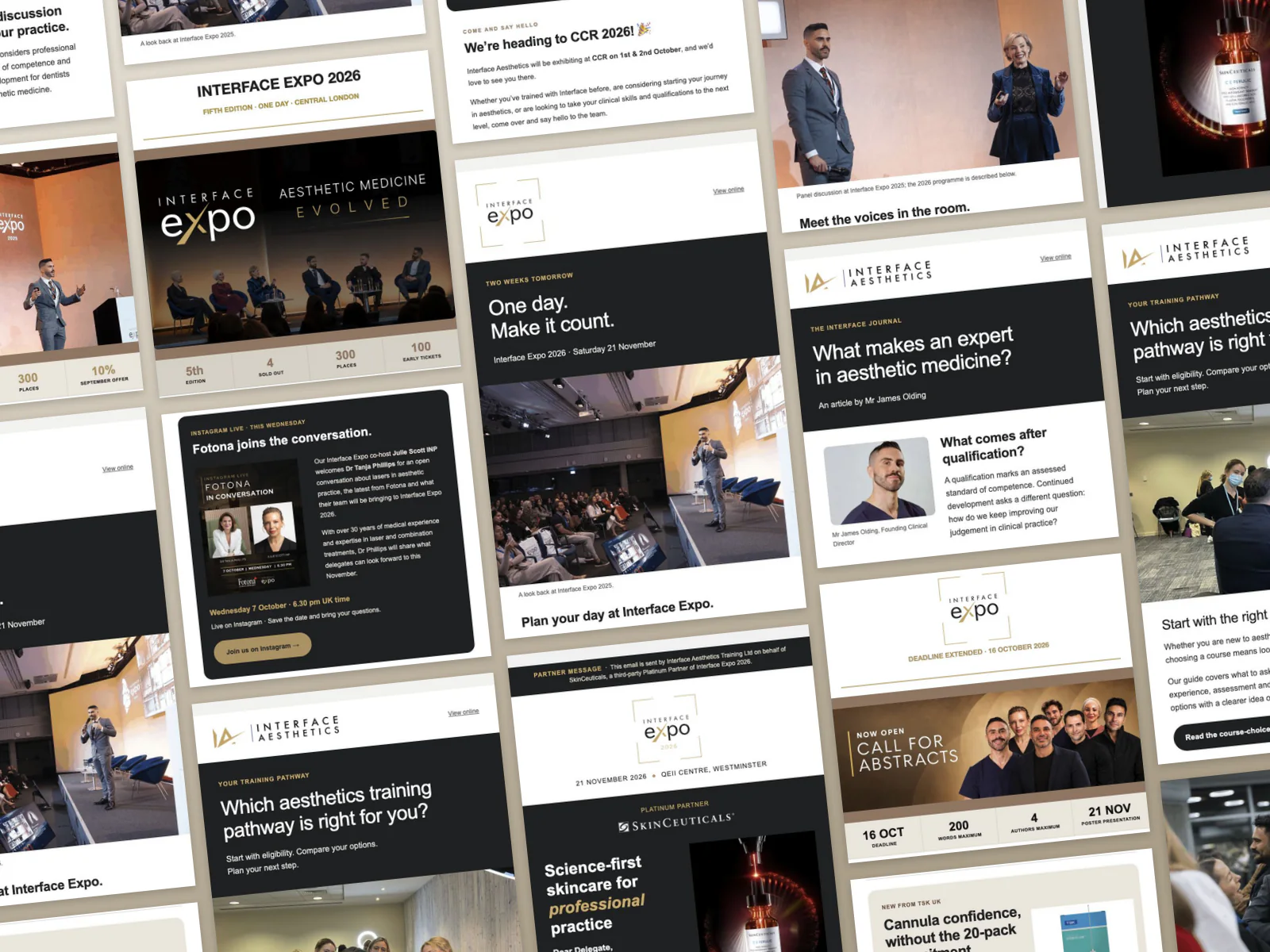
A delegate making travel plans needs different information from a practitioner deciding whether to read a guide. The Expo team also had commercial partners with artwork of their own. The brief was to make those differences obvious at a glance, without making each message look as though it came from a different organisation.
Change the message as the event approaches
The programme edition puts a speaker and auditorium beneath the headline, then breaks the day into sections. The final reminder swaps in a photograph of delegates and a short checklist before they travel. The masthead stays in place; the reader's next step changes.
Let the sponsor determine the lead image
SkinCeuticals opens with a lit serum bottle on charcoal. TSK pairs its packshot with a short headline on a pale background. For Fotona, the focal point is a conversation between two speakers. Each is identifiable as an Expo partner email without forcing three different stories into the same product layout.
Give the article a mobile reading order
In the desktop Journal the author's portrait sits beside the introduction. On a phone, it moves above it. The training guide does something simpler: it keeps the opening question, classroom photograph and link in the same order, letting the headline and paragraph wrap naturally at the narrower width.
What we delivered
- Mailchimp editions for the Expo programme, final reminder and early ticket invitation
- Partner spotlight designs for SkinCeuticals, TSK and Fotona
- A training pathway guide and two editorial emails for the Interface Journal
- A separate CCR exhibition invitation built around the stand number
The outcome
Readers could recognise Interface in each format, but the action was specific to the message: plan a day at Expo, find the team at stand J84, explore a training route or read an article. The original desktop and mobile editions let you see those choices for yourself.
These are excerpts from sent Mailchimp campaigns. Mobile examples are separate 390-pixel captures, not resized desktop images. Animation is shown as a still, and event dates and offers belong to the original editions.
What the client said
Marcelo Pereira on working with MattDarm across Interface Aesthetics, including newsletters and email campaigns:
We initially hired Matt for a specific project to help us improve and develop our LMS on LearnDash. He did such an excellent job that what started as one project quickly developed into an ongoing working relationship.
Since then, we have continued to give Matt more responsibility across the business. He now supports us not only with our LMS, but also with our website updates and maintenance, and more recently with our newsletters, email marketing campaigns and SEO.
What has impressed us most is his versatility and his willingness to take on new challenges. Matt is proactive, responsive and genuinely interested in understanding what we are trying to achieve as a business. Rather than simply completing a task, he looks for solutions and ways to make things work better.
It is quite rare to find someone you trust enough to keep expanding the scope of work you give them, but that has definitely been our experience with Matt. We are extremely pleased with the work he has done for us and very happy to continue working with him.
Highly recommended.

Marcelo Pereira
General Manager, Interface Aesthetics
What this means for your project
Before laying out a newsletter, finish this sentence: after reading, someone should be able to do what? Finding a stand number calls for one bold line. Choosing a training route needs more space and a link to the guide.
Case study updated ·
Related work
More projects in this area


People we've worked with
Real projects, built together
Let’s Grow Your Business Together
Tell us about your project and we’ll show you exactly how we’d grow your business. Book a free 30-minute discovery call, no pressure.