

Key Takeaways
- A complex service does not need a complicated website. Visitors need to understand who you help, what changes after working with you and what to do next.
- UX is the structure and decision-making behind the journey. UI is the way the finished interface looks and feels. Both matter, but neither can rescue an unclear offer.
- Service businesses lose good enquiries when they make people decode jargon, hunt for proof, guess the process or fill in a long form before they know whether the service is right for them.
- A better service website guides visitors from a familiar problem to a clear outcome, then backs the promise with evidence, useful detail and a low-friction next step.
- You do not need to put every internal detail on the site. You do need to remove the uncertainty that stops a suitable buyer from starting a conversation.
Service businesses have a particular website problem. What they sell is often valuable precisely because it is not simple. A legal service, a consultancy, a specialist build, a healthcare practice, a financial product or a technical agency can involve lots of moving parts. The owner knows how it works. The visitor usually does not.
That gap is where a lot of good websites quietly lose work. The site lists every capability, adds a handful of broad claims and sends visitors to a contact form. It looks respectable, but it has left the hard work to the person who is already unsure whether they are in the right place.
Good UX/UI design is about making that decision easier. It does not mean dumbing down the service or making your business look less expert. It means organising the information so the right person can recognise their problem, see a credible route forward and feel comfortable taking the next step.
This is how to make complex offers easier to buy without relying on gimmicks or turning your website into a brochure no one reads.

Start with the problem the visitor already understands
Most businesses write service pages from the inside out. They begin with department names, service labels or the way they describe the work internally. Customers do not always use the same language.
A visitor may not be looking for “digital transformation support” or “strategic implementation”. They may be thinking: “Our enquiries are falling through the cracks”, “I need this site rebuilt without losing leads”, or “I do not know how to explain why we are different.” The job of the website is to meet them at that point, then show that you understand the bigger work behind it.
Try this simple test for every important page. Can a new visitor answer these questions in the first few moments?
- Is this for a business like mine?
- Do they understand the problem I am dealing with?
- What result could this help me get?
- What happens if I decide to speak to them?
If the answer is no, the page is not yet doing its commercial job. You can have beautiful colours, polished animation and perfect typography, but the visitor still has to work too hard. That is a UX issue before it is a design issue.
For a specialist service, clarity is one of the strongest forms of trust. It tells the visitor you have done this before and you can explain it without hiding behind vague language.
UX and UI: what each one actually does
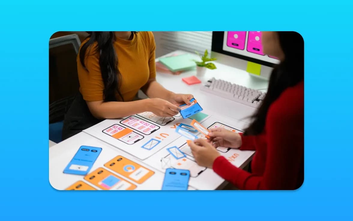
UX means user experience. It covers the route someone takes through the site: what they notice first, what they need to know next, how they compare options and how easy it is to complete a task. It is the structure, hierarchy, content order, navigation, form flow and small decisions that make a journey feel easy or frustrating.
UI means user interface. It is what they see and interact with: type, spacing, buttons, colours, cards, form fields, visual cues and responsive layouts. UI gives the experience its visual character and makes the practical choices feel coherent.
In real projects, they should work together. A clean interface makes the route easier to follow. A good route tells the interface what it needs to highlight. But they are not interchangeable.
For example, a large “Book a Call” button does not solve anything if the page has not explained why someone should book. A beautifully designed pricing table is not useful if the visitor cannot tell which service they need. And a detailed process diagram will not help if the important question, “Can you handle my situation?”, is still unanswered.
That is why our UX/UI design service begins with users, goals and content as well as visuals. The interface should make the business easier to buy from, not merely more fashionable to look at.
Give each important visitor a clear route
Many service businesses serve more than one type of customer. That is normal. The mistake is presenting all of them with the same wall of generic copy.
Instead, make the main routes obvious. A visitor should be able to spot the service, industry or outcome that sounds most like them without reading every page. That might mean separate service pages, clear “I need help with…” options, industry landing pages or a short guide that helps them choose the right starting point.
There is a balance here. Too many routes create choice paralysis; too few make people feel the site is not for them. Start with the groups that matter most commercially. You can always expand once you know what visitors are actually searching for and asking about.
Each route should then tell a consistent story:
- The situation or problem you recognise.
- The outcome you are aiming for together.
- What your approach involves, in human terms.
- Evidence that you can deliver it.
- The next, low-pressure action.
That sequence feels natural because it follows the conversation a good salesperson or consultant would have. It gives people enough detail to feel informed without forcing them to become experts before they can make contact.
Explain the work without overwhelming people
Complex services often get described in one of two unhelpful ways. Either the copy is so broad that it could apply to anyone, or it goes so deep into methods and terminology that a visitor gives up halfway through.
A better approach is layered information. Start with the result and the practical reason it matters. Then give a short explanation of how you work. After that, offer deeper detail for the people who need it: process sections, FAQs, case studies, scope notes or downloadable information.
Someone who is early in their search may only need to know that you can solve the problem. Someone comparing suppliers may want to see the process, timescales, expertise and likely next steps. Both should be able to find what they need without being forced down the same route.
Use examples whenever you can. Rather than saying you offer “end-to-end support”, describe the sort of work that is included. Rather than claiming to be “results-driven”, show a situation you improved and how the client experienced the change. Good examples make an abstract service feel real.
This does not mean publishing confidential client information or promising a fixed outcome that depends on many variables. It means being specific enough to prove you understand the work.
Make proof easy to find, not easy to miss
Service businesses ask people to make a decision before they can see the finished outcome for themselves. That makes proof especially important.
Testimonials help, but they should not be the only evidence. A strong service website may also include case studies, examples of work, clear credentials, useful FAQs, process explanations, team expertise, practical before-and-after details or a clear description of who the service is not right for.
The last point is worth saying out loud. Being clear about fit can increase trust. If you only work with certain project sizes, locations, types of business or levels of readiness, say so. The right prospect will appreciate not being led on, and your team will spend less time on unsuitable enquiries.
Proof needs to sit close to the decision it supports. Put a relevant case study near a service explanation. Show reassuring detail around a form. Explain the handover or aftercare near the point someone is worried about being left alone. Do not hide all the good stuff on one generic testimonials page and hope people will eventually find it.
Reduce friction at the point of enquiry
When a visitor reaches out, they are taking a small risk. They may worry they will be pushed into a sales call, judged for not knowing the right words or asked for a budget before they understand the options. Your form and call to action can either calm that worry or make it worse.
A clear next step works better than a vague instruction. “Tell us what you are trying to achieve and we will suggest the right first step” is more useful than “Submit”. “Book a 20-minute discovery call” is more reassuring than “Contact us” if that is genuinely what happens.
Keep the first form short. Ask only for the information needed to start a useful conversation. You can gather deeper detail later, once there is mutual interest. Long forms are not automatically better qualified; they often just persuade busy, suitable people to leave.
Also make the process visible. If someone enquires, do they get a reply, a call, a proposal or a short audit? Explain it. When people know what happens next, the decision feels smaller and less risky.
Design for scanning, not just reading
Even people who are genuinely interested will not read a service page word for word on the first visit. They scan for signals: a relevant problem, a clear headline, a trusted name, a useful example, a price cue, a next step.
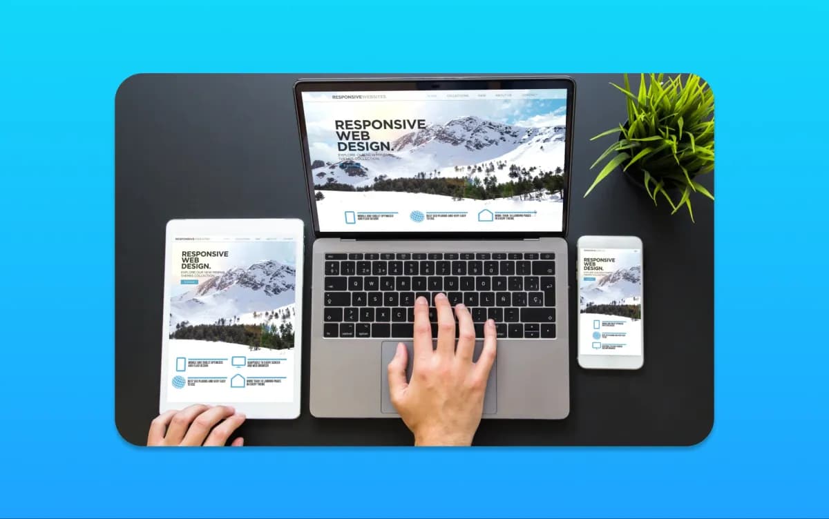
That is why good UI matters. Headings should carry meaning on their own. Paragraphs should be short enough to absorb. Buttons should look like buttons. Links should describe where they go. Important information should not be hidden inside a sliding carousel or a block of tiny text. On a phone, everything should still make sense without pinching, zooming or guessing.
None of this is flashy, and that is the point. Design should remove effort. A visitor should feel that the site is helping them make sense of a decision, not asking them to admire the site before they are allowed to find the answer.
If an older site is making this difficult, a website redesign can be about far more than a new coat of paint. It is a chance to fix the structure, content hierarchy and conversion route that the old build has outgrown.
Use the questions you already hear in real life
Your best UX research may be sitting in your inbox, call notes and sales conversations. Look for the questions people ask before they buy: “How long will it take?”, “Have you done this for a business like mine?”, “What do I need to provide?”, “Can you work with our existing system?”, “What happens after launch?”
Those questions belong on the site. Not all on the homepage, but in the right place. They tell you where visitors are uncertain and what information they need to move forward.
This is also where a website audit and consultation is useful. It can uncover where a current journey is unclear, which pages are not supporting the sale and what should be fixed first. You do not need to rebuild everything because a site is imperfect. Sometimes a smarter page structure, stronger proof and a better enquiry route make a meaningful difference.
The Bottom Line
Complex offers do not need complicated buying journeys. The visitor does not need to know every detail of your work before they make contact. They need to recognise their problem, understand the value of your approach, see enough proof to trust you and know what will happen next.
That is what good UX/UI design does. It turns expertise that lives in your team’s heads into a clear, credible journey people can actually use. If your current site looks polished but still makes the right customers work too hard, get in touch. We can look at the journey honestly and decide whether you need focused UX/UI design, a stronger custom website, or a practical set of changes that makes your existing site easier to buy from.