
Key Takeaways
- Organise navigation around customer tasks rather than internal departments.
- Test labels and paths with people unfamiliar with the site.
- Check keyboard, mobile, focus and expanded-menu behaviour.
- Use task completion alongside analytics; longer time on a page is not automatically better.
In the UK, having a strong online presence is key for your business. A well-designed website is essential for keeping customers coming back. I’ve seen how good navigation can make a big difference in your success online.
A good navigation system makes it easy for visitors to find what they need. This reduces frustration and boosts satisfaction. In this article, we’ll share tips to enhance your website’s navigation, improving your customers’ experience.
Understanding the Importance of Navigation in UX
Navigation is key to making websites user-friendly. It greatly affects how users interact with a site. This, in turn, impacts their overall experience and satisfaction.
What is Website Navigation?
Website navigation helps users find what they need on a site. It includes menus, breadcrumbs, and links. These elements work together to make the user experience smooth and easy.
Good navigation is more than just links. It’s about creating a clear structure. This lets users predict where to find information.
Why Navigation Affects User Satisfaction
Navigation plays a big role in user satisfaction. It determines how easily users can find what they’re looking for. When navigation is clear and simple, users tend to be happier and more engaged.
- Reduces frustration by minimising the number of clicks to find information
- Enhances the overall user experience by providing a clear and logical structure
- Increases user engagement by making it easier to explore the website
Key Metrics for Navigation Efficiency
Measure whether people can complete a defined task and where they hesitate. A longer visit can reflect interest or confusion; a quick exit can mean failure or that the person found a phone number immediately. Do not interpret a metric without the task context.
GA4 bounce rate is based on the share of sessions that were not engaged sessions, not simply every visit without another page view. Use the platform's definitions and combine analytics with observation. Record the path, errors, first choice and whether the person found the information without help.
Common Navigation Issues Encountered by Users
Good navigation is key, but many sites struggle with it. It’s vital for website owners to know these common problems. This way, they can make their sites better and keep users happy.
Even sites that look great can lose lots of visitors because of bad navigation. This shows how important it is to focus on making navigation easy.
Overly Complicated Menus
One big problem is menus that are too complicated. When there are too many choices, it can confuse users. They might find it hard to find what they need.
To fix this, group similar items together. Also, keep the main menu simple with only a few options.
- Group related links under relevant categories.
- Use clear and concise labels for menu items.
- Choose the number of top-level items from the content and tasks, then test whether the labels are understandable.
Inconsistent Navigation Labels
Labels that don’t match can confuse users. It’s important to keep labels the same everywhere on your site. This makes it easier for users to find their way around.
Make a style guide to keep your labels consistent. This guide should list the standard terms and phrases used on your site. It helps make sure your labels are clear and easy to understand.
Lack of Mobile Compatibility
Most people use their phones to browse the internet. If your site isn’t mobile-friendly, it’s a big problem. Your site needs to work well on all devices.
To make your site better for mobile users, make sure it’s easy to navigate on small screens. Use simple navigation patterns, like the hamburger menu, to help users on phones.
Principles of Effective Website Navigation
Let’s look at what makes website navigation effective and easy to use. Good website navigation is key for a smooth user experience. It follows a few important principles.
Simplicity is Key
A simple navigation system helps users find what they need fast. To keep it simple, consider these tips:
- Keep menu items to a minimum to avoid confusing users.
- Use clear and short labels for menu items.
- Avoid technical terms that might confuse users.
Logical Structure and Hierarchy
A logical structure and hierarchy are essential for guiding users. You can achieve this by:
- Organising content into clear groups.
- Using submenus for related content.
- Making sure important content is easy to find.
Consistency Across Pages
Consistency is vital for a seamless user experience. To keep things consistent, make sure:
- Navigation menus are in the same spot on every page.
- Menu items have the same labels everywhere.
- The design and layout are the same on all pages.
By sticking to these principles, you can create a great website navigation system. This will improve user experience and help your website succeed.
How to Design User-Centric Navigation
Exploring user-centric navigation can change how your website works. It’s key to make your site easy for users. By knowing what users want, you can make your site simple and meet their needs.
User-Centric Design Approaches
A user-centric design focuses on what your audience needs. This means:
- Understanding how users behave and what they like
- Creating profiles of your ideal users to guide your design
- Making your navigation simple and consistent
This approach helps you design a site that fits your users’ needs. It leads to a better experience for everyone.
Incorporating User Feedback
Using user feedback is vital to improve your site. You can get feedback in many ways, such as:
- Testing with users and getting their thoughts
- Using online surveys to ask questions
- Looking at data to see how users act
By listening to users and using data, you can keep making your site better. This makes users happier and more satisfied.
A/B Testing for Navigation
An experiment can compare navigation options when the traffic and task volume support a planned analysis. For a small site, begin with a content inventory, a simple proposed hierarchy and observed tasks. A handful of sessions is not enough to declare a statistically reliable winner.
Test labels before adding visual polish. Ask where the person expects to find a service or answer, and observe their first choice. If the wording is misleading, a more attractive dropdown will not resolve the underlying problem.
Utilising Design Elements for Better UX
Let’s look at how design elements like visual cues, white space, and colour schemes can improve your website’s navigation. By using these elements well, you can make your website easier to use and more intuitive.
Strategic Use of Visual Cues
Visual cues are key for guiding users on your website. They can be arrows, icons, or highlighted text that catch the eye. Make sure these cues are consistent and match your brand’s look.
- Use arrows or other directional indicators to point users towards calls-to-action or important information.
- Highlight interactive elements like buttons or links to make them stand out.
- Ensure that visual cues are not overwhelming or distracting.
Importance of White Space
White space, or negative space, is the empty area on your webpage. It’s vital for a clean and easy-to-use website. Good use of white space reduces confusion and makes navigation smoother.
To use white space well, remember:
- Balance text and other elements with enough white space to avoid clutter.
- Use white space to clearly separate different sections of your webpage.
- Make sure your website’s layout is easy on the eyes and breathable.
Colour Schemes and Navigation
Colour schemes greatly affect your website’s navigation and user experience. Different colours can create different feelings and highlight certain elements. Choose colours that fit your brand and the emotions you want to share with users.
To use colour schemes for navigation effectively:
- Pick a palette that matches your brand and stays consistent on your website.
- Use contrasting colours to make important elements like calls-to-action or navigation menus stand out.
- Make sure your colour scheme is accessible to everyone, including those with visual impairments.
Optimising Navigation for Mobile Devices
Mobile devices are now the main way people access websites. Making navigation easy on these devices is essential. A good mobile navigation system can greatly improve user experience and keep them coming back.
Responsive Design Principles
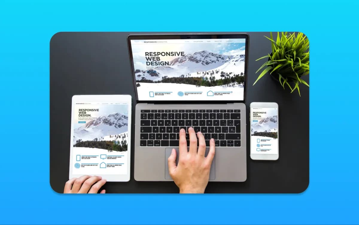
Responsive design is key for a great mobile navigation. It means designing websites that work well on all devices. This includes fluid grids, flexible images, and media queries to adjust the layout for different screens.
- Use fluid grids to ensure that your website’s layout adjusts smoothly to different screen sizes.
- Implement flexible images that scale appropriately on various devices.
- Utilise media queries to apply different styles based on the device’s characteristics.
Navigation Patterns for Mobile
Mobile devices need special navigation patterns. These include the hamburger menu, tab bars, and collapsible menus. They make navigation simple and reduce clutter on small screens.
When picking a navigation pattern, think about your website’s complexity and your users’ needs. For simple sites, a tab bar might be best. More complex sites might need a hamburger menu to stay clean.
Testing Mobile Navigation Usability
Testing is vital to make sure your mobile navigation is easy to use. Usability testing lets you see how real users interact with your site on mobile. You can use remote tools or in-person sessions for this.
Focus on how easy it is for users to find what they need. Check if the navigation is intuitive and if there are any technical problems. These are important areas to test.
By focusing on mobile optimisation, using responsive design, and testing usability, you can greatly improve your website’s user experience. This will help increase engagement.
The Role of Accessibility in Navigation
When we design websites, we must think about all our users. Accessibility is more than following rules; it’s about making sure everyone can use our sites. This means everyone, no matter their abilities.
Web Accessibility Matters
Web accessibility is key because it lets people with disabilities use our sites. This includes those with visual, auditory, motor, or cognitive disabilities. By making our sites accessible, we make them better for everyone and reach more people.
- Enhances user experience for everyone
- Improves website usability
- Expands audience reach
- Supports business reputation and social responsibility
Best Practices for Accessible Navigation
To make navigation accessible, we should follow certain guidelines. These include making our navigation clear, easy to use, and robust. We should use clear labels, provide text for images, and make sure it works with a keyboard.
- Use clear and consistent navigation labels
- Provide alternative text for images and icons
- Ensure keyboard navigability
- Test with screen readers and other assistive technologies
Legal Considerations in the UK
Accessibility requirements depend on the organisation and service. Do not treat a generic checklist as legal advice or assume one rule applies identically to every site. The UK government's accessibility guidance explains the public-sector context and related duties; obtain appropriate advice for your circumstances.
Regardless of the legal assessment, include accessible navigation in the design and test process. The W3C menus tutorial is a practical implementation reference.
Tools and Techniques for Testing Navigation
Let’s look at the tools and methods for testing website navigation. It’s key to check your site’s navigation to find and fix issues. By using different tools and methods, you can learn a lot about how users navigate your site.
Usability Testing Methods
Usability testing lets you watch real users on your site to spot any navigation problems. You can do this in a few ways:
- Remote testing: Tests users in their own space.
- In-person testing: Gives you more control over the test.
- A/B testing: Compares two versions of a page to see which one works better.
Analytics and Tracking User Interaction
Analytics tools show how users interact with your site. Important metrics to watch include:
- Page views and bounce rates.
- Click-through rates and how users move around.
- Conversion rates and how well users achieve their goals.
Tools like Google Analytics give you deep insights into user behavior. This helps you spot areas to improve.
Heatmaps and User Journey Mapping
Heatmaps show where users click and scroll, revealing patterns. User journey mapping creates a visual of how users move through your site. These tools help you:
- Spot confusing parts of your site.
- Understand what users find hard.
- Make your site easier to use.
By using these tools and methods, you can make your site’s navigation much better. This leads to happier users and more successful conversions.
Continuous Improvement of Navigation Systems
Keeping your website’s navigation top-notch is a big job. It needs constant work to stay effective and easy to use. This ensures your site’s navigation is always up to par.
Gathering Insights
It’s key to keep getting feedback from users. You can do this with surveys and usability tests. These tools help spot where you can make things better.
Iterating on Design
Make changes to your navigation based on what users say. This makes it simpler and more straightforward. It’s all about making things easier for your visitors.
Staying Ahead
Keep up with the latest in UX trends and tech. This lets you use new ideas and tools to improve your site’s navigation. It’s all about staying ahead of the game.
By always looking to improve, your website’s navigation will stay top-notch. This leads to a better user experience, more engagement, and growth for your site.
A task-based review you can run before redesigning
Choose three realistic tasks: find a suitable service, assess a relevant example and start an enquiry. For a store, substitute finding a compatible product, checking delivery and purchasing. Write the task without telling the participant which menu label to choose.
Ask someone unfamiliar with the site to carry it out. Observe the first click, hesitation, backtracking and any point where the wording creates a wrong expectation. Do not coach them through the intended route. Record whether the problem is the hierarchy, the label, missing content or the interaction itself.
Use those observations to propose one clear change. If people look for pricing under a service page, adding another global menu item may be less useful than making the pricing explanation easier to find on that page. Preserve working routes and retest the task after the change.
Check menu behaviour beyond the mouse
Use a keyboard to open the menu, move through links, close it and return to the page. Check visible focus and whether hidden links remain unexpectedly reachable. On a phone, test opening, scrolling, closing and following a nested link without another overlay covering the control.
Use appropriate links for navigation and buttons for actions such as opening a menu. Keep the expanded state understandable to assistive technology. Provide meaningful headings and landmarks; the W3C page-structure tutorial explains how structure supports orientation.
A service-navigation example from actual work
The GTS Reading redesign organised a broad transport offer through service, industry and fleet information alongside a quote route. These are different ways a customer might approach the decision. The project illustrates content organisation, not a measured claim that a particular menu produced a fixed increase in leads.
For your own site, link useful guides and project evidence from the relevant service context. The traffic-without-enquiries guide explains how to review the complete journey, while the landing-page guide covers focused campaign destinations.
MattDarm's UX and UI design and website redesign services can help investigate the structure. Send us the tasks customers struggle with, rather than only a screenshot of the menu, so the recommendation addresses the actual difficulty.
Frequently Asked Questions
How many items should be in the main menu?
There is no universal ideal count. Choose clear groups from the content and customer tasks, then test whether people understand the labels and can find the relevant information.
Does a high bounce rate prove navigation is bad?
No. Interpret the metric according to the analytics definition and the visitor's task. Someone may leave after finding the information they needed, while a long visit may reflect confusion.
Should every page be reachable in three clicks?
Do not use a fixed click count as the main design rule. A slightly longer but understandable path can be better than a short confusing one. Test task completion and the clarity of each decision.
How can we test a mobile menu?
Use the actual open, scroll, expand, close and link-following interactions on a phone-sized view, and check keyboard and assistive-technology behaviour separately. A static screenshot does not verify the interaction.
Do we need a full redesign to fix navigation?
Not necessarily. Clearer labels, a better hierarchy or contextual links may solve the problem. Diagnose the task difficulty first and preserve routes that already work.