
Key Takeaways
- A high-converting homepage quickly tells the right visitor what the business does, who it helps and what sensible next step to take.
- Conversion is not always an immediate sale. For a service business it may be a qualified enquiry, booked call, visit to a relevant service or download that supports a longer decision.
- Strong proof, clear routes and honest commercial context usually do more than extra animation or a louder button.
- Design the homepage around real questions and objections, then test it on a phone, with a keyboard and on a slower connection.
- Measure the journey beyond the button. A form completion is useless if the enquiry is unsuitable, never arrives or receives no response.
A high-converting homepage is not the page with the most calls to action. It is the page that helps the right person recognise that they are in the right place, understand the offer and move to an appropriate next step without unnecessary doubt.
That sounds simple. In practice, homepages often carry years of internal requests: every service, award, announcement, partner logo, social feed and campaign competes for the same first screen. The result may look busy while saying very little.
This practical checklist is for UK service businesses, agencies and growing companies. It will help you review a current homepage or brief a new one without relying on invented “conversion hacks” or universal percentage claims.
1. Define the Conversion Before You Redesign
Write down the main action the homepage should support. For an emergency plumber, a telephone call may be the priority. For a specialist consultancy, a detailed project enquiry may be more valuable than a rushed calendar booking. An online retailer may want a visitor to enter a category, search or continue a basket.
Choose one primary conversion and a small number of useful supporting actions. These might be:
- viewing the most relevant service;
- reading a credible case study;
- checking coverage, pricing approach or availability;
- joining a mailing list with a clear reason;
- contacting the business in an accessible alternative way.
Do not treat every click as equal. A vague “Learn more” click tells you less than a visit to a clearly named service. A booked call can look successful in analytics while wasting time if the visitor has no budget, wrong location or unrealistic deadline.
Our guide to website traffic without enquiries helps separate a traffic problem from an offer, page or follow-up problem. If you need evidence before changing the design, a conversion rate optimisation audit can trace the complete route rather than judging the homepage alone.
2. Make the First Message Specific
The first meaningful heading should help a suitable visitor answer three questions:
- What does this business provide?
- Is it relevant to someone like me?
- Why should I keep reading or act?
“Transforming tomorrow through innovative solutions” answers none of them. A clearer message names the service, audience or outcome in ordinary language. It does not need to contain the full pitch. It needs to earn the next ten seconds of attention.
Support the heading with one or two sentences that add useful detail: location, specialism, type of customer or what is different about the process. Avoid squeezing an entire About page into the hero area.
The W3C's page structure tutorial explains how meaningful regions and logically nested headings improve navigation and orientation. Clear structure helps people scan visually and helps screen-reader users move between sections.
3. Use a Call to Action That Matches the Decision
The main call to action should describe what happens next. “Request a website review”, “Check trade pricing” or “Tell us about your project” is clearer than “Submit”. The wording should also match the commitment. Do not label a long sales form “Get a quick quote” if nobody can quote without a detailed consultation.
Keep the primary action visually consistent. Repeating it after relevant proof can be helpful; changing its wording and destination in every section creates doubt. Use a secondary action only when it serves a genuinely different visitor need, such as seeing work before making contact.
For a focused campaign with one audience and one offer, a dedicated landing-page design service may be more suitable than forcing the homepage to serve every advert. The guide to building a high-converting landing page explains that narrower use case.
4. Show the Right Services Without Creating a Directory
Visitors need enough choice to find the relevant route, but not an unfiltered list of everything the company has ever sold. Group related services in language customers use. Give each one a short explanation and a descriptive link.
Prioritise by customer demand and business value, not internal department order. If one service is relevant only after an existing relationship, it may not deserve equal homepage space. If your audience uses an umbrella term while your team uses five specialist labels, explain the umbrella first and let the service pages handle detail.
Each service destination should continue the promise made on the homepage. The heading, proof and next step must feel connected. Our custom website design service treats this information structure as part of design, not content pasted in after the visuals are approved.
5. Put Proof Beside the Claim It Supports
Generic testimonial carousels are easy to ignore. Useful proof is specific and placed near the claim or objection it answers.
Depending on the business, that may include:
- a named case study with the starting problem, work and outcome;
- a customer quotation with enough context to judge relevance;
- recognised qualifications or memberships, accurately described;
- real project imagery rather than stock photographs;
- a clear process that shows how risk is managed;
- delivery areas, response expectations or support arrangements;
- transparent limitations as well as strengths.
Do not invent statistics or display customer logos without permission. If confidentiality prevents a public name, explain the sector and scope without implying a public endorsement. Trust grows when evidence can be checked.
6. Answer the Expensive Objections Early
Think about what prevents a serious prospect from contacting you. Common questions involve price, timescale, suitability, location, disruption, ownership and what happens after delivery.
You do not always need to publish a fixed price. You can explain a starting point, typical scope, minimum engagement or the factors that change a quote. “Every project is unique, contact us” makes the visitor do all the work and often attracts enquiries neither side wants.
Use a short process section to explain the next steps. If the first call is exploratory, say so. If you need access, measurements or a brief before quoting, make that clear. If a project normally takes weeks rather than days, do not hide it until the proposal.
7. Design the Mobile Homepage First
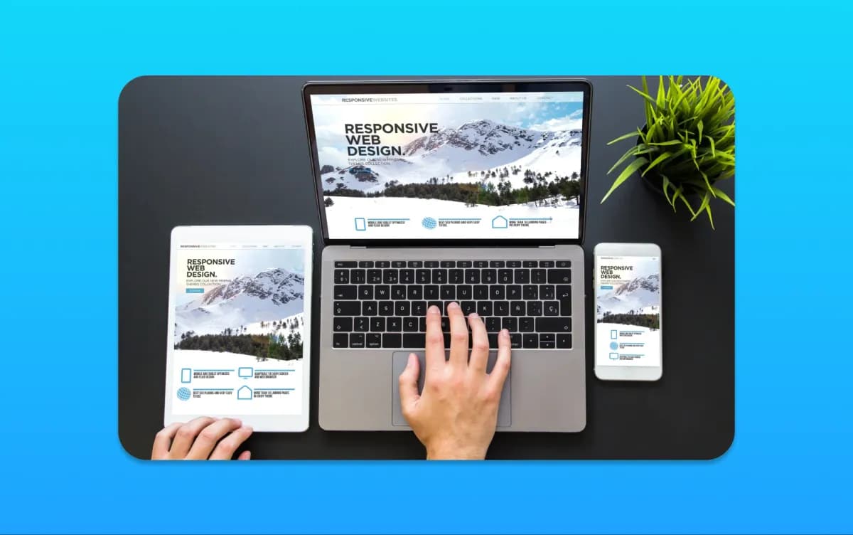
On a phone, vague sections and repeated messages become a long obstacle course. Decide which information genuinely deserves to appear before the first major action. Keep contact options usable without letting a sticky bar cover content or form controls.
Test the homepage with real content, not neat placeholder sentences. Long service names, two-line buttons, customer quotations and validation errors reveal problems that a design mock-up misses.
Google's current page experience guidance recommends considering Core Web Vitals, secure delivery, mobile display, intrusive interstitials and whether people can distinguish the main content. It also makes an important point: good tool results do not guarantee top rankings, and page experience is broader than one score.
If mobile behaviour is central to the rebuild, our responsive and mobile-first design work starts with those priority journeys.
8. Make the Page Fast Enough to Use
A high-resolution video, several font files, a chat widget, review embed, tracking stack and animated portfolio can make a homepage feel impressive in a meeting and slow on a customer's phone.
List every third-party script and ask what business purpose it serves. Compress and correctly size images. Reserve space for media so content does not jump. Load below-the-fold features only when needed, but do not hide primary content behind an interaction that search engines or assistive technology cannot reach.
Measure representative pages in the development process and check real-user data after launch where enough traffic exists. If the design is right but the implementation is heavy, use focused website speed optimisation rather than removing proof blindly.
9. Make Forms Easy to Understand and Recover
Ask only for information needed at that stage. A useful project form can be longer than a newsletter form, but every field should have a purpose. Mark required information clearly, use visible labels and explain the expected format before an error occurs.
When an error happens, keep the information already entered, place a clear message beside the field and move focus appropriately. Test the form with a keyboard and a screen reader. Confirm that it works when cookies are declined and that the enquiry reaches the intended person.
W3C guidance on headings and labels says they should describe topic or purpose. That straightforward rule improves both forms and content. Clever labels make people stop and interpret; clear labels let them continue.
10. Give the Visitor a Safe Way to Check the Business
Include accurate company details and an easy route to About, contact, privacy and relevant terms. A local business should keep its address, service area, opening hours and telephone information consistent. A regulated supplier should state credentials precisely and link to an appropriate register where useful.
The footer should not become a dumping ground, but it must help visitors confirm who is responsible for the website and find essential information. Make email and telephone links usable, and offer an alternative for people who cannot or do not want to use the main form.
11. Measure the Whole Enquiry Journey
Record the homepage actions that matter, then compare them with real leads. A useful monthly review might ask:
- Which channels bring suitable prospects to the homepage?
- Which service routes do they choose?
- Do form completions match received messages?
- How many enquiries are qualified?
- How quickly does the business respond?
- Where do people encounter an error or abandon a task?
Avoid changing five things at once based on a quiet week. Form a clear hypothesis, make a controlled change and give it enough relevant traffic to judge. Small businesses may not have the volume for formal experiments on every detail; customer interviews, recorded support questions and careful journey testing are still useful evidence.
Our analytics and reporting service can connect website events with the outcomes the business actually values.
Homepage Conversion Checklist
- The primary audience and conversion are agreed.
- The first heading names the offer in plain language.
- Supporting copy explains who it is for and why it matters.
- The main call to action describes the next step.
- Service routes use customer language and descriptive links.
- Claims have nearby, checkable proof.
- Price, timescale, location and suitability objections are addressed.
- Mobile content order is intentional rather than compressed from desktop.
- Images, fonts and third-party scripts have been reviewed.
- Headings, controls, focus and form errors have been tested for accessibility.
- Contact, legal and company information is accurate.
- Analytics records useful actions without counting the same event twice.
- Submitted enquiries reach the right person and receive a response.
- A named owner reviews performance and customer feedback after launch.
Frequently Asked Questions
What is a high-converting homepage?
A high-converting homepage helps the right visitors understand the offer, trust the business and complete an appropriate next step. The conversion may be a purchase, qualified enquiry, booking or visit to a relevant service page.
What should appear at the top of a business homepage?
Use a clear heading that names the offer, short supporting detail about the audience or outcome, and a call to action that explains what happens next. Add only the navigation and reassurance needed at that point.
How many calls to action should a homepage have?
There is no universal number. Choose one primary action and a small number of useful alternatives. Repeat the main action where it follows relevant information, but avoid making every section compete with a different request.
Do testimonials improve homepage conversions?
Relevant, verifiable testimonials can reduce doubt, especially when they explain the customer's situation and outcome. Anonymous praise in a rotating carousel is usually weaker than specific proof placed beside the claim it supports.
How do I know why my homepage is not converting?
Check traffic intent, message clarity, mobile usability, speed, form delivery, analytics and lead quality. Watch people attempt the main journey and compare recorded conversions with the enquiries the business actually receives.
Make the Homepage Earn Its Space
Your homepage does not need to say everything. It needs to make the next useful decision easier. Start with a clear audience, honest offer and credible proof, then remove anything that competes without helping.
If the current page is attracting visits but not suitable enquiries, contact MattDarm. We can review the journey through focused UX/UI design, conversion work or a wider redesign, and tell you which level of change the evidence supports.