
Your product is great. Your service is excellent. But when people visit your website or see your social media, something feels off. It looks... amateur. You know it, and worse, your customers know it too.
The good news: looking premium doesn't require a premium budget.
I've worked with dozens of UK small business owners who felt trapped by this paradox. They were delivering exceptional work, yet their brand looked like it belonged in 2008. The frustrating part? They didn't know where to start fixing it, and they assumed it would cost thousands.
It doesn't have to.
In this guide, I'll walk you through the exact elements that separate premium-looking brands from ones that scream "we just threw this together." More importantly, I'll show you how to implement these changes without hiring a £5,000 design agency—though I'll also tell you where professional investment actually matters.
By the end, you'll have a clear action plan to elevate your brand's perception and start charging what you're actually worth.
Why Brand Perception Matters More Than You Think
Let's start with an uncomfortable truth: people judge your business in milliseconds.
Research from the University of Missouri found that visitors form an opinion about your website in just 50 milliseconds. Fifty. That's faster than you can blink. And within that blink, they're already making decisions about whether you're professional, trustworthy, and worth their money.
This isn't just about aesthetics. This is about survival.
A professional-looking brand signals competence, reliability, and quality—whether that's true or not. Unfair? Maybe. But it's psychology. When a potential customer sees a polished brand, their brain releases trust hormones. They assume you're established, successful, and worth the premium price you're charging.
Conversely, an amateur-looking brand creates a credibility gap. You could have the best service in the UK, but if your website looks like a student project, customers will assume you're cutting corners everywhere.
The numbers back this up. A study by Stanford University found that 46 per cent of visitors judge credibility based on aesthetic design. Almost half. And Forrester Research discovered that consumers will pay 20-25 per cent more for products and services from brands they perceive as premium and professional.
That's not pocket change. That's the difference between struggling and thriving.
The invisible credibility gap is real, and it's costing you money right now.
The 5 Elements That Make a Brand Look Premium
Before we dive into tactics, let's identify what actually makes a brand feel expensive and professional.
It's not luck. It's not magic. It's five deliberate choices that separate luxury brands from everything else.
1. Typography
Your choice of font is the fastest way to look either professional or amateur. Unfortunately, most small businesses don't even realise they're making a choice—they just use whatever comes default.
Default fonts scream "I didn't think about this." Professional brands scream "I care about every detail."
2. Colour Palette
Here's what you'll notice about premium brands: they don't use many colours. Luxury brands typically stick to 2-3 colours maximum. This constraint creates visual harmony and elegance. More colours = cheaper. Fewer colours = premium.
3. Whitespace
This is the secret sauce that separates expensive-looking designs from cluttered ones. Premium brands use generous whitespace (also called negative space). They're not afraid of empty room on a page. Cheap designs cram everything in.
4. Consistency
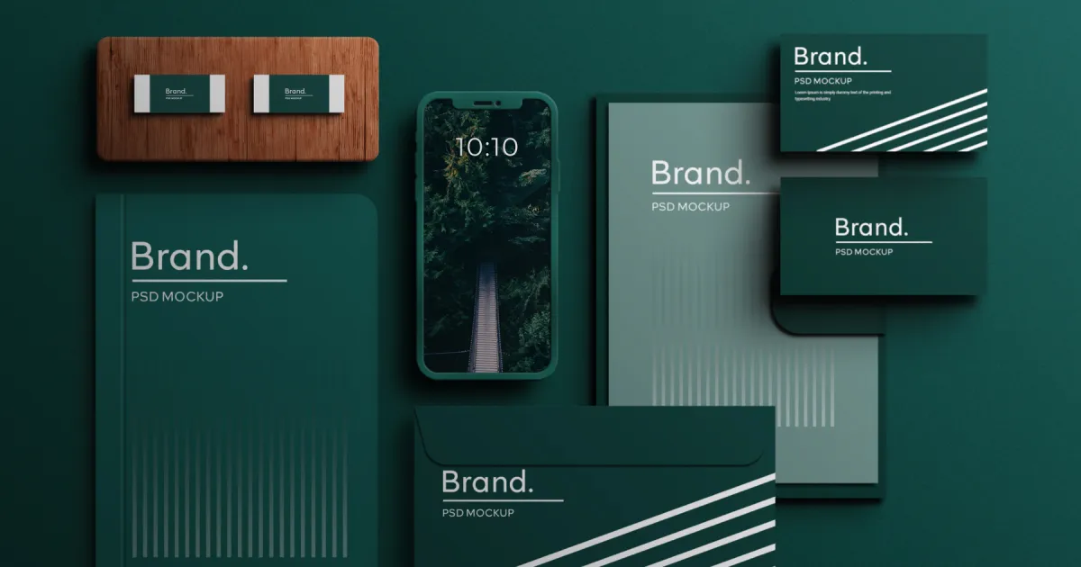
A brand that looks the same everywhere—website, social media, email, business cards, invoices—automatically feels more established and professional. Inconsistency screams disorganised and chaotic.
5. Photography Style
The images you use matter enormously. Professional photography or carefully curated, on-brand imagery looks premium. Random stock photos, blurry smartphone pictures, and generic "handshake in a suit" images look cheap.
Now let's go deep on how to implement each of these.
Typography: The Easiest Upgrade
Let me be direct: if you're still using Arial, Times New Roman, or—heaven forbid—Comic Sans, your brand is starting from a disadvantage.
Comic Sans has become a joke for a reason. It signals that whoever designed this didn't take it seriously. Same with Papyrus (yes, some businesses still use it). These fonts scream amateur hour.
The good news? Upgrading your typography costs absolutely nothing.
Google Fonts is a library of free, professionally designed typefaces that look as good as fonts costing £200+. The best part: they're optimised for web use, so they load fast and look crisp on every device.
Here's how to think about typography strategically:
Choose one font for headings and one for body text. This is the foundation. A striking, personality-filled font for headlines. A clean, highly legible font for your body copy.
Some combinations that look premium:
- Elegant & professional: Playfair Display (headings) + Lato (body)
- Modern & bold: Montserrat (headings) + Open Sans (body)
- Friendly & approachable: Raleway (headings) + Source Sans Pro (body)
- Luxury & refined: EB Garamond (headings) + Raleway (body)
When you choose fonts, pay attention to:
- Line height: Add generous space between lines. This is whitespace at work.
- Font size: Don't skimp. Make body text at least 16px. Headings should command attention at 32px or larger.
- Font weight: Vary between regular and bold to create hierarchy and visual interest.
The reason this matters: premium brands obsess over typography because it's the fastest way to communicate quality without saying a word.
Colour Strategy: Less Is More
Now let's talk about colour, because this is where most small businesses go wrong.
Walk into a luxury brand store. Look at their colour palette. You'll see restraint. You'll see maybe three colours, used consistently, with purpose.
Walk into an amateur brand's website. You'll see colours everywhere: bright orange here, hot pink there, neon green sprinkled throughout. It's visual noise.
Here's the rule: Choose a maximum of three colours.
- Primary colour: Your main brand colour. This is on your logo, key buttons, and critical design elements.
- Secondary colour: A complementary colour for variety and emphasis.
- Accent colour: Usually for call-to-action buttons and highlights.
Everything else? Neutrals. Black, white, greys, and maybe one warm neutral like beige or light brown.
This creates visual hierarchy and sophistication.
For UK audiences, certain colours carry psychological weight:
- Dark blue: Trust, professionalism, stability (perfect for B2B and finance)
- Dark green: Growth, sustainability, health (ideal for wellness and environmental brands)
- Charcoal/black: Luxury, premium, sophistication (works for any premium positioning)
- Gold/brass: Exclusivity, tradition, prestige (careful—only if you're actually premium)
Avoid colours that cheapen your brand: neon variants, overly bright pastels, and clashing combinations.
To build your colour palette, try:
- Coolors.co: Generate beautiful palettes and lock colours you like
- Adobe Color: Extract colour schemes from images you love
- Color.review: Test how colours work together
One more thing: dark backgrounds create a premium feeling. Not black necessarily, but dark charcoal, dark navy, or dark green. Light, bright white backgrounds can feel sterile and cheap if not balanced with excellent typography and whitespace.
Consistency Across Every Touchpoint
Here's where many small businesses fail: they'll invest in a nice website, then their social media looks completely different. Their email signature doesn't match. Their business cards feel disconnected.
This inconsistency erodes trust. Subconsciously, customers think: "This business seems disorganised."
Premium brands are obsessively consistent. Everything comes from the same visual language.
Your website should look like your social media. Your social media should match your email newsletters. Your business cards should feel like they belong to the same brand as your invoices.
To achieve this, create basic brand guidelines. You don't need a 50-page document—even a simple one-pager helps:
- Logo usage and clear space rules
- Your colour palette (with hex codes)
- Your primary fonts (and fallbacks)
- Photography style guidelines (what kind of images you use)
- Tone of voice (how you communicate)
Then apply these consistently everywhere:
- Website: Your colour palette, fonts, and photography style
- Social media: Branded templates, consistent posting grid, matching profile aesthetic
- Email: Branded header, consistent colours, matching signature
- Business cards & invoices: Same colours, same fonts, professional layout
- Packaging (if applicable): Everything matches
The magic happens when someone sees your email, then your website, then your social media—and immediately knows it's all from the same brand. That recognition builds trust and premium perception.
Your Website: The First Impression
Your website is your digital storefront. More people will form an opinion about you here than anywhere else.
Here's what a premium website looks like (and what an amateur one doesn't):
Premium websites: - Clean, uncluttered layouts with generous whitespace - Professional, on-brand imagery (not generic stock photos) - Clear, intuitive navigation - Lightning-fast loading times - Mobile-perfect design - Clear, compelling messaging - Trust signals (testimonials, client logos, certifications, case studies) - Consistent colour use throughout - Professional typography - Clear calls-to-action
Amateur websites: - Cramped, cluttered layouts with no breathing room - Random stock photos or blurry images - Confusing navigation - Slow loading - Not optimised for mobile - Vague messaging ("We're great at what we do") - No social proof - Inconsistent design - Default fonts - Unclear what the next step is
If you're building or rebuilding your website, investing in professional custom website design is one place where the ROI is genuinely exceptional. A poor website actively loses you customers. A great website attracts them.
But if you're working with a budget, focus on these non-negotiables:
- Whitespace: Don't fill every pixel. Let your design breathe.
- Professional imagery: Use high-quality photos of your actual work or team, not generic stock photos.
- Clear messaging: Answer within three seconds: What do you do? Who's it for? What's the next step?
- Mobile optimisation: Test on your phone. If it doesn't work on mobile, you've lost most of your visitors.
- One clear CTA per section: Tell people what to do next. Don't overwhelm them with options.
Social Media That Matches
Social media is where consistency pays massive dividends.
When someone follows you on Instagram, sees a post, clicks your profile, and sees a cohesive, professional aesthetic—they immediately perceive you as more established and premium.
Here's how to execute this:
Branded templates: Tools like Canva Pro let you create templates with your brand colours, fonts, and logos built in. Every post automatically looks like it comes from you.
Consistent colour use: Stick to your 2-3 brand colours. Don't use random new colours for each post.
Professional profile photo: Hire a photographer for a professional headshot or product photo. This single image represents your brand to hundreds or thousands of people.
Grid aesthetic: Plan your feed. Some brands alternate colours. Some keep a consistent tone (warm, cool, bright, dark). The point is intentionality.
Regular posting: An abandoned social media account looks worse than no account. If you post, stay consistent.
Tools that make this easy:
- Canva Pro: Branded templates, stock photos, simple design
- Buffer or Later: Schedule posts, maintain consistency
- Adobe Express: Quick, branded graphics
DIY vs Professional: Where to Invest
Let's be honest about what you should DIY and where professional investment actually matters.
DIY (and save money here): - Social media graphics (use Canva with branded templates) - Email newsletters (tools like Mailchimp) - Blog posts and website copy (you know your business) - Simple graphic adjustments - Scheduling and posting
Professional investment (worth the money): - Logo design: Your logo is your most important visual asset. Invest here. - Brand identity design: A cohesive visual identity is the foundation. Get it right once. - Brand guidelines: Clear guidelines make everything else faster and more consistent. - Professional website design: This is your digital shop. Make it count. - Professional photography: High-quality images of your work or team elevate everything.
Here's the principle: invest in foundational elements (logo, brand identity, website) that get used everywhere. These have compounding value. Save money on execution (social posts, newsletters) where you can use tools and templates.
Quick Wins You Can Implement Today
You don't need to overhaul everything at once. Start with these quick wins that cost nothing (or near-nothing) and immediately elevate your brand perception.
1. Upgrade Your Fonts
Switch from default fonts to professional Google Fonts. Pick one for headings, one for body text. Implement across your website and email.
Time: 30 minutes Cost: £0 Impact: Massive
2. Simplify Your Colour Palette
If you're currently using five or more colours, cut it down to three. Make every design decision based on these three colours only.
Time: 1 hour Cost: £0 Impact: Immediate visual upgrade
3. Add Whitespace to Your Website
Review your homepage. Wherever elements are cramped together, add space. Increase margins, padding, and line heights.
Time: 2-3 hours Cost: £0 Impact: Instantly looks more premium
4. Create a Branded Email Signature
Design a professional email signature using your brand colours and fonts. Make sure your name, title, and contact details look polished.
Time: 30 minutes Cost: £0 Impact: Every email now represents your brand
5. Audit Your Social Media
Do all your posts look like they come from the same brand? If not, commit to using Canva templates going forward.
Time: 1 hour Cost: £0-13/month for Canva Pro Impact: Consistent, professional presence
6. Get a Professional Photo
Hire a local photographer for a professional headshot or product photo. One great image lifts your entire brand perception.
Time: 2-3 hours (shoot) + waiting for edits Cost: £150-400 Impact: Every profile, website, and document looks more legitimate
7. Write Clear Messaging
Audit your website copy. Can someone understand what you do in three seconds? Is your call-to-action crystal clear?
Time: 2-3 hours Cost: £0 Impact: More conversions, better-perceived professionalism
When to Bring in the Professionals
These quick wins go a long way. But if you want to truly transform your brand's perception, consider professional help.
A professional branding project—which includes brand strategy, brand identity design, design systems, and website design—doesn't just make you look better. It:
- Attracts customers who perceive you as premium
- Allows you to charge premium prices
- Creates a foundation that lasts for years
- Makes every marketing effort more effective
- Builds internal confidence and alignment
The brands I've worked with report that professional branding pays for itself within 3-6 months through higher prices, more customer trust, and better conversion rates.
The Bottom Line: You're Closer Than You Think
Looking premium doesn't require premium spending. It requires thoughtful choices about typography, colour, whitespace, consistency, and imagery.
Most of these choices cost nothing. Some require small investments (professional photos, quality tools). A few—like professional branding work—are worth the investment for the compounding returns.
The question isn't "Can I afford to invest in my brand?" It's "Can I afford not to?"
Every day you show up with an amateur-looking brand, you're losing customers and leaving money on the table. Starting today, you can begin implementing changes that shift perception and justify premium pricing.
Ready to take the next step? Whether you want to handle some of these upgrades yourself or partner with a professional, we're here to help.


